Two Design Systems

From visual identity to usability, and back.

Company

GLKB · YOW.tv

My Role

UX/UI Designer, and Product Design Intern — sole designer on both systems

Tools

Figma · Claude Code · Claude Design · HTML/CSS

Timeline

2026

Description

A biomedical research platform and an indie-film streaming service, six months apart, needing the opposite halves of the same thing.

Context

A design system is not a set of tokens. It is the answer to what the product is about. I got that question from both ends: a research platform with a token structure and no visual language, and a streaming brand with a visual language and no steps in anything. I invented one and derived the other. On the second I agreed to no shadow and a corner small enough to read as none, and have drawn every component since with two fewer tools. Its face, yellow and corner are in a live stylesheet today.
One product had a system with no taste; the other had taste with no system

I was the sole designer on both: the type, colour, spacing and radius decisions, the token files and the documentation. Greg, the streaming company's branding director, owns the brand I derived from and made the final typeface call. The research platform's product manager built the structure I kept and sent me out to find the rest.

Two products, broken in opposite directions


The research platform had a design system already, built by its product manager, and the structure worked: components, text styles, a place for everything. What it did not have was a visual language. The colour, the layout, the corner radius and above all the reliance on shadow all read as software from ten years earlier, on a product half of which is an AI agent. The mechanical tell was in the type scale. Its seven styles set line height as a percentage of size rather than as a value, so three of the seven resolved to decimals — a thirty-six-pixel heading landed on 43.2. The decimals were not carelessness; they were what that kind of scale produces. And the product manager knew before I did. Once she trusted me she sent me out to explore, benchmark and come back with something — the one thing I had to keep was the brand blue.


The streaming company had the opposite problem. A branding director, a brand book, a logo toolkit, a type guide: a real identity, made for posters and films and never once for an interface. Black, one grey, three accent colours, and no steps in any of them. There was nothing in it that could put one surface above another.

The two inherited sheets, stacked: above, the research platform's type table of seven styles whose line heights are percentages; below, the streaming brand book's colour page of six flat colours with no steps under them. Both are labelled as inherited work, not the designer's.

The inherited sheets side by side, unretouched: seven type styles whose line heights are percentages, three of them resolving to decimals, and a colour page with no steps under it. One scale cannot say why a number is what it is; the other palette cannot say nearer or further.


I shipped a spacing scale, then took it back out


Spacing went out as three platform modes. One name, space/10, resolved to forty pixels on mobile, forty-eight on web and seventy-two on television — which is what an abstraction is for. The designer picks a meaning and the system supplies the number.


It was hiding the wrong thing. Nothing in a handoff told a developer which of the three values they were reading, so a name that promised sameness delivered difference, and the developer had no way to tell which one had arrived. A second failure I had not predicted: the modes did not switch reliably on the canvas either.


So I took my own abstraction out. Spacing is now one flat scale in which the name is the value — space/N is N times four pixels, on every platform — and the difference between platforms is which step you pick, not what a step resolves to. The migration ran to twelve rows: web space/10 becomes space/12, still forty-eight pixels. Not one rendered pixel moved on any screen.

A spacing token shown resolving to three different platform values, beside the flat scale that replaced it, above a twelve-row migration table whose last column reads zero on every row

What shipped beside what replaced it, with the migration between them and a column counting what each row moved. Every figure in that column is zero — a correction to a naming system is worth making when it costs the screen nothing.


The sharper icon set was the wrong one


Material Symbols and Phosphor were the two worth comparing: neither is soft, and the product could not carry a soft one. Side by side at the sizes the interface uses, Material won on its own terms — square terminals matching the buttons, a stroke matching the type.


Then I stopped looking at icons and looked at a screen. The buttons were square because we had agreed to no radius, and so was every card, every poster crop, every field. Material was not matching the language; it was the fifth thing on the page saying the same thing. An icon is the smallest element on a screen, which makes it the cheapest place to put the only curve.


So Phosphor shipped, on the argument that had lost twenty minutes earlier. It is also the set I used on the project before this one, and I would rather say that than let the comparison read as a discovery. The test was fair and it was the wrong test: one component against another tells you which is better drawn and nothing about which one the screen needs.

Two rows of six icons on a near-black ground, Material Symbols above and Phosphor below, then the same four components — a poster tile, a continue-watching card, a yellow play button and a search field — drawn twice, once carrying each set, marked not shipped and shipped.

The same six icons in both sets drawn large and un-adjudicated, then the same four components carrying each set at working size. In isolation the square terminals win on match; in context they are the fifth square element in a group with no curve anywhere else.


The Outcome: two systems, and the sheet each one needed


One had to be invented and one had to be extracted. What follows is what each turned out to be — the face, the scale, the corner, the silhouette, and the argument that had to be won before any of it could be drawn.

The Research Interface: Quiet Layout So the Evidence Is Loudest


The platform is two things at once. Half is an AI agent and wants the forefront; half is biomedical evidence and wants a library. I went quiet rather than choose, because the interface is mostly reading and the reading should be the hero.


That has a price, and it is where the craft went. With the layout doing nothing, everything the product says about itself is carried by the radius, the absence of shadow, and above all the typeface. The radius came down small — not sharp, because the work is serious, and not soft, because it should read as evidence. Shadow went entirely; it was what dated the file I inherited.

One GLKB content surface shown at full height in the new visual language, with three decisions pulled out beside it: the corner radius enlarged three times, the shadow shown as drawn and as it would look if one were added, and the body type at fourteen on twenty-two.

One content surface in the new language, captured from the design file, with the three decisions pulled out beside it: a fourteen-pixel corner at 1440, the shadow that was given up and is drawn in here only to show what was removed, and a reading scale of 14 on 22 — both whole numbers, where the sheet it replaced set 36 at 120% and resolved to 43.2. The reference snippets in the right-hand panel are placeholder text in the design file itself.


Geist: Where a Sans Serif Keeps Its Handwriting


Thirty-six faces went into the test, and the question at each was which half of the product it sided with. The first reason is ordinary: a sans serif keeps both the modernism and the readability.


The second is the real one. If you really look at the little details, the letterforms convey a sense of humanity — especially the l. Geist does not end that stem. It turns it a quarter-round in the bottom tenth of the letter and finishes with a foot reaching most of a stem's width to the right, where Archivo and DM Sans both stop flat. It is the difference between a letter and a ruled line, and it is what keeps I, l and 1 three objects in a product whose body text is gene symbols and variant ids. The lowercase l is what got me.


The scale under it is twenty-four styles, every line height a whole pixel value rather than a percentage of the size. That is where the old file's fractions came from: a heading carried a decimal not because anyone typed one, but because of how the scale was specified.

A light sheet: thirty-six typeface specimens set in two rows, then the lowercase l from Geist, Archivo and DM Sans normalised to one height and one stem width on a shared baseline, the letters I l 1 x in each face over cap-height and x-height guides, and the replacement type scale printed against the inherited sheet's percentages.

Thirty-six candidate faces in two rows, then the chosen lowercase l beside the same letter from the two it was weighed against, at heading size and at reading size; then the scale, each line height a whole pixel against the percentage the old sheet used.


The Licence: A Type Bill That Scales With Success


The brand book is unambiguous: the typography is almost entirely one family, and no other typefaces are to be used. It specifies twenty-seven cuts plus a second display face for the widths that family does not carry. Nobody had checked the price first.


What moved it was not the size of the bill but its shape. The licence meters on three axes at once — per platform, per registered user, per pageview — and the plan increased all three. Past about twenty-two styles a partial licence costs more than the whole family of ninety; twenty-seven was specified. The cost does not scale with the roadmap. It scales with success.

The brand book's Acumin Pro mandate quoted on the left against the values read off the live page on the right — typeface served Archivo, occurrences of Acumin zero — with the three-axis metering model, per platform, per registered user and per pageview, set out beneath both.

The mandate on the left is the branding lead's document, shown as the constraint the change overturned and never as my work; the values on the right were read out of the page the property serves. One family with a width axis did the job the mandated family needed a second one for.


The Type Test: Five Faces, and One Empty Cell


The replacement had three conditions: free, close enough to the mandated family to keep the identity, and variable on the width axis — a mixture of widths inside a phrase is part of how the brand reads.


So the test is a grid: five faces across, five treatments down, one screen per cell. Twenty-five cells, twenty-four filled. The empty one sits in the row that tests width: that face has no condensed cut, so it is not argued out of the shortlist, it cannot appear in it. The survivors are set again beside the mandated family on the real headline, so a stakeholder compares pictures. The branding director made the final call from that board.

A five-by-five matrix of five typefaces against regular, condensed and three corner treatments, twenty-four cells filled with specimen text and one — Libre Franklin at condensed — left empty and labelled beneath, above four finished poster headlines set in the four surviving faces.

The five-by-five grid at full width with the empty cell left empty and labelled, then the four-up finalist board beneath it. A test whose axes are the criteria eliminates a candidate by leaving a hole where its answer would go.


Shape as Type: What the Silhouette Had to Carry


On the film home page now in build, nearly every surface is a rectangle of somebody else's artwork, and this system had already given away the corner and the shadow. The outline of a card is what is left to say what kind of thing it is, and an outline can be spent once. The home page had argued for months about mixing poster shapes for rhythm against keeping every poster portrait, which reads like the shelves of a video store. I was on the mixture side. Both are arguments about how a page looks, and a service using social to promote streaming can borrow a pattern from neither neighbour. So the outline went on meaning instead. Portrait is a title. Three posters compressed into a square is a collection somebody made. A circle is a person. Landscape is something you already started. Neither of us had been arguing about meaning, and the rhythm I had argued for is what that outline can no longer pay for.


Landscape carries two rows rather than one, and that is the rule rather than a hole in it: it is what a single title looks like when its frame has to be wide, and only two things make a frame wide. Continue Watching has to show a trickplay image, which is a frame cut out of the video and therefore the shape video already is. Trending is ordered by a number, so nobody assembled it, and the square is the shape that means somebody did. What the grammar is actually missing is the two shapes that made it one. The square and the circle exist because a collection and a person are social objects, social came out of the release, and both went with it into the one handoff frame marked do not build.

Four card silhouettes drawn as outlines only on a dark ground: a portrait rectangle and a landscape rectangle at full weight marked shipped, and a square made of three narrow panels plus a circle, both dashed and chipped designed, not shipped. No film artwork is reproduced.

The four silhouettes, outlines only — the frames they carry are licensed film artwork and none of it is reproduced here. Portrait and landscape are built, drawn at the ratios measured off the home frame; the square and the circle were never built, so both are drawn at 1:1. The square is three panels compressed side by side rather than one poster cropped, because the construction is what says collection.


Two Systems, Opposite Ends: One Name, One Value


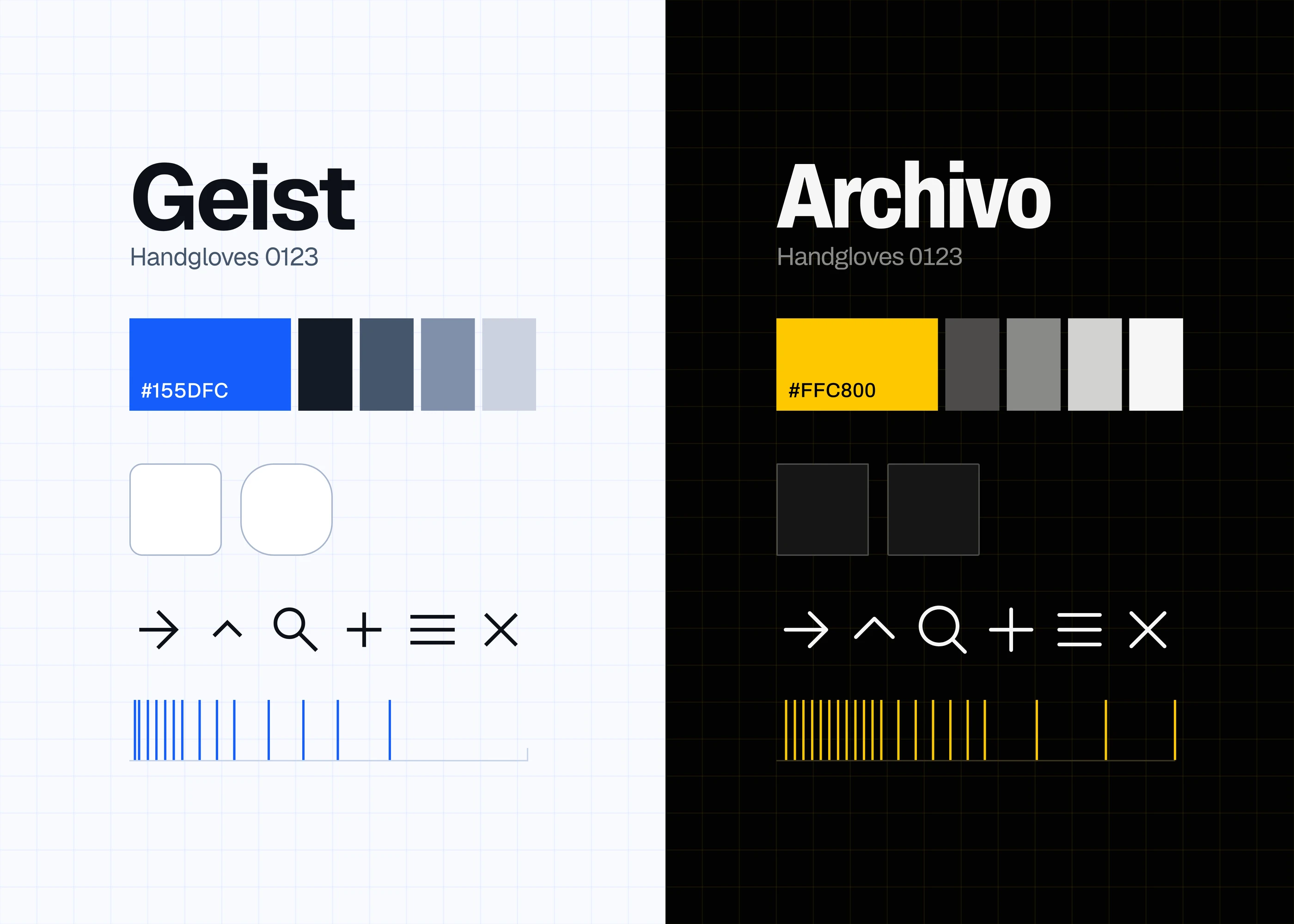
Every difference between the two sheets is downstream of what each product is about. One is light, on the blue it inherited: small radius, no shadow, square-terminal icons. The other is dark, black with one yellow, a corner that never exceeds four pixels, shadow given up as an everyday tool, and the round icons, for the reason above.


Underneath, both spacing scales ended as one flat run of steps where the token name is the value and there are no platform modes — the same rule from opposite directions, and on one only after taking the alternative back out. Typography did not converge, and that asymmetry is the argument: twenty-four pixels of body at arm's length and twenty-four at ten feet are not the same decision, while twenty-four pixels of gap is a gap.


Both systems live in a file of their own, separate from the product files. Everything used to sit in one place, and a change there rippled in ways nobody could see. Splitting it makes a change cheap across every design file — and, more importantly, legible to the code and to the agent working alongside it.

A sheet split light and dark down the centre: the research system's type, colour, corner, hairline, icon set and fourteen spacing steps on the left, the streaming system's type at three widths, colour, corner, icon set and twenty-one spacing steps on the right, both spacing runs plotted on axes of the same length.

Both systems on one sheet: face and line heights as real type, the corner drawn as components rather than described, the two spacing scales aligned, the icon sets at working size. They diverge on everything but the naming rule — and on the shadow neither of them has.


Impact


The streaming system is the one a stranger can check. Its promo property serves the typeface, the yellow, the near-white and the two- and four-pixel corners out of its own stylesheet, and the mobile app on the App Store is built on the same tokens. The research platform's system is in build: the tokens are exported as a file the developers consume, and the product's own stylesheet is now almost entirely on the new face, with a handful of rules surviving from the one it replaces.


The connected-television work is thinking rather than delivery, and I want to be exact about which. I specified the token set against a directional pad — which has no cursor and no hover, so focus is the only affordance there is — before any of that platform work began, because the company runs television apps and I wanted them to look like one product when it started. What exists is one low-fidelity frame. The specification is thick and the file is thin.

I agreed to work without a radius and without a shadow


Shadow went first. Several conversations with Greg, the branding director, and he was right about the brand: it is fast, direct, punchy, and it does not want depth. Why would it need shadows? I agreed then and I agree now. Radius went nearly the same way for the same kind of reason.


Put the two together and I had very little left to work with. Radius and shadow are the two cheapest ways an interface separates one thing from another and tells you which of them you can press, and I had given both away on a product where nearly every surface is a rectangle of film artwork. Everything after that has to be done with spacing, weight, colour and border, and each of those is already carrying something else.


The clearest instance is the smallest one. An informational field had to read as a field without reading as a button. I drew it with a full border and no radius, and it just looked like somebody forgot to put a radius on there — not a decision, an omission. What worked keeps only the bottom edge, so the line under the text does the job the box was supposed to do, and it does it well.


I like that field. It is also the answer of somebody working with two tools fewer than whoever designed the thing next to it, and I am the one who gave them away.

One text field drawn three times - under a finger, under a pointer, and inside a focus ring - with a note stating that no D-pad screenshot exists

One field in three input models — pressed, hover, and the focus a remote leaves behind — drawn rather than captured, because the television surface is one low-fidelity frame. Pressed and hover differ by one step of fill and nothing else; focus takes a full ring, because at ten feet a bottom edge is not enough.


Credit


Branding — Greg, branding director at the streaming company — the brand book, the type guide and the logo toolkit the system is derived from, the shadow conversation, and the final call on the typeface


Manager — Jack, at the streaming company — granted the home-page work and sourced the licensed film artwork the page is drawn on


The streaming team — the social feature set, its order and its page allocation were settled together. I contributed a lot to sorting it out, and it was not all my call


Product — the research platform's product manager — built the first system, kept its structure in the second, and sent me out to explore with one constraint


Development — the engineering teams at both companies, who build from these files — and who are the reason a token name has to resolve to one thing