GLKB Dev Experience

Shipping the questions with the answers.

Company

GLKB · Jie Liu Lab, University of Michigan

My Role

UX/UI Designer — sole designer on the product

Tools

Figma · Claude Code · Markdown

Timeline

May – Jun 2026

Description

GLKB is a biomedical literature knowledge base with a public agent API. Its developer surface was my first project there and my last: the documentation in the first week, the dashboard at the end of the summer.

Context

I was handed a twenty-one-page document and told to turn it into API documentation. It argues; it does not answer. I kept its argument on the front page and built the half it did not have around it — endpoints, parameters, response fields — then shipped it with three questions engineering had not settled written into the code a developer copies. The documentation is deployed to a password-protected development host and held there until a developer has reviewed it in full. The dashboard is live on glkb.org, behind sign-in.
Shipping a developer site with its unanswered questions written into the code

I was the only designer on the developer surface, and I did the competitive research, the information architecture, the page content and the interface. The product manager set the brief and carried it between me and the agent team, who own the API. A front-end developer built the site.

An API, a console for keys, and nothing to read


GLKB is a knowledge base built so that a claim about the biomedical literature can be checked against the literature. Its interface is built for a researcher asking a question. The API is for the opposite person: someone who will never open the product, and who wants to push five thousand genes through it from a script. That person had a working endpoint, a screen for generating keys, and nothing to read.


Three things made writing it harder than writing it well.


There was nothing in-house to match. No documentation existed for any other part of the platform, so there was no house structure, no house voice, and no precedent to argue from.


Engineering's own questions were open, and specific pages depended on them. Some of what a reference page has to state had not been decided yet, and the documentation could not wait for it.


And there was no reader to ask. The API had users inside the team and none outside it. I asked to speak to a developer using it and was pointed at the team's own.

The GLKB developer console with its API Doc tab open, the source document laid out at full product width inside the panel: a title, the argument, a Core Idea section with an http and a twenty-seven-line python code block, and four reliability sections, with an on-page contents list beside them.

The source document set at product width, in the panel it was first asked to live in. The prose wants a full measure and the twenty-seven-line code block wants the same width for a different reason — so the column can only get wider. The panel's problem is visible before the page count is mentioned.


Plot Twist 1: I called it the wrong material, and it was the wrong genre


I asked what I was building from. What came back was a twenty-one-page document, and my first read on it was that it was not documentation — "sure there's some good content, but this thing does not read like API doc really." It opens by arguing that literature review does not scale, states a core idea, gives four reasons the outputs can be trusted, then works four tasks end to end and catalogues twelve more. There is no authentication section, no parameter table, no status codes, no rate limits and no response schema. The address of the API is a placeholder in every code sample it contains, including the one headed "try it in sixty seconds."


So I went and read Anthropic's and OpenAI's developer documentation — not for a structure to copy, for the shape of the thing. Both sidebar hierarchies, both authentication patterns, both page templates, and their code-example language matrices, five languages against eight.


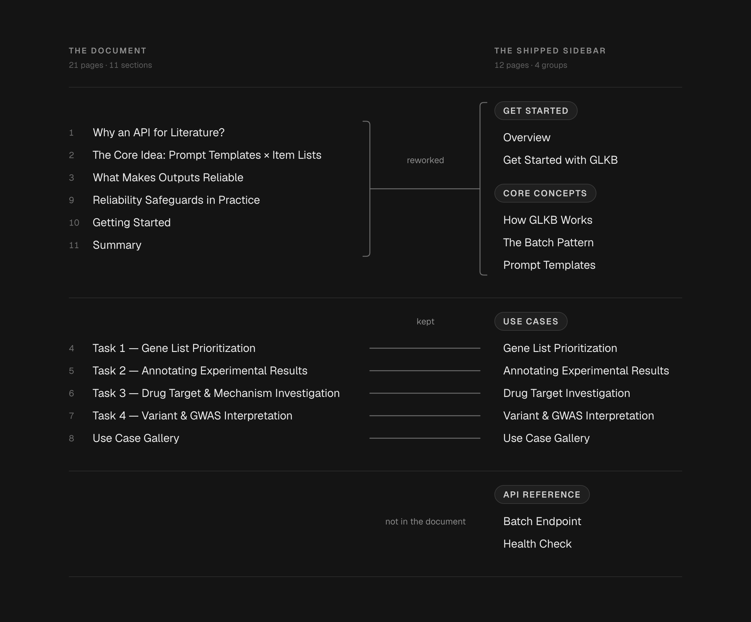
Read against those, my first judgement was wrong. The document was not unusable material. It was one entire half of documentation and none of the other — all persuasion, no reference. Five of the twelve pages that shipped carry its own section titles. The two under API Reference are the two it hands off to a placeholder.

Two lists facing each other across a gutter on a near-black ground — the source document's eleven sections right-aligned, the shipped sidebar's sixteen lines left-aligned, twelve entries under four group heads — with five ruled horizontals joining the titles that survive and running on into empty ground.

The two lists set at the same scale with the shared titles aligned. Five rows meet; the reference group meets a placeholder URL and a filename. The gap on the right is the work, and it is drawn as a gap rather than described as one.


Plot Twist 2: The documentation left the product, and I had agreed to put it there


On the second day I was told where it went. The product's API screen carried three tabs — the key list, usage, and one more — and the documentation went under the third. I thought that was a curious decision and I said so, in about that many words, and then I built it there. I laid the whole document out at product width inside that panel: the title, the argument, the core idea with its endpoint and a twenty-seven-line client, the four reliability sections.


Then it came back. "Why are these under the tab — we want an external site." I said that I had been told to put them there and had confirmed it. The answer was that it needed to go to an external site anyway. I was annoyed for about a day.


And the instruction that reversed mine was right, for a reason that is not a matter of taste. The finished set is twelve pages and 1,067 lines. A tab inside a product screen is a panel, and a panel cannot hold a persistent sidebar, a search field, an on-page table of contents, and twelve long-form pages carrying parameter tables and copyable code. The first answer lost on content volume, and the content volume was already knowable when I agreed to it.


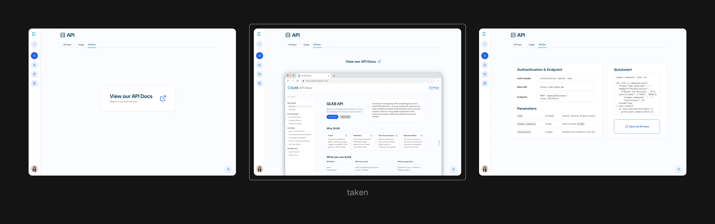
What followed was nine frames on how a product hands somebody off — two ideas, not nine. One puts a browser window on the screen so you can see that you are leaving. The other keeps a condensed reference in the product — authentication, endpoint, a parameter table, a quickstart — and links out for the rest. We took the first, and the reason was workload.


What shipped is the plainest form of it. Not the browser window: a button.

Three answers to where the API documentation lives, stacked at one scale: the whole document inside a third tab, an external API Docs button beside the table, and a condensed in-product reference carrying auth, endpoint, parameters and a quickstart with the link out inside it. None of the three shipped. A strip beneath counts the nine frames explored.

The fork drawn on one canvas: the same console with the whole document inside a third tab, then with an external button beside the table, then a condensed in-product reference carrying authentication, the endpoint, a parameter table and a quickstart, with the link out sitting inside it. None of the three is what shipped — the console became a dashboard, further down this page. Nine explored frames run underneath, seven of them variations on one card.


The Outcome: four surfaces, in the order they were made


The front page, the map that produced the site around it, the way you search it, and the screen it all points back to.

Four pages of the shipped GLKB developer documentation site shown whole at one scale, so their differing full heights are visible: the front page with its four cards and three-column table, the use case gallery, the batch endpoint reference and the health check.

Four of the twelve shipped pages, whole and at one scale. The front page argues — four cards and a three-column table — and the reference pages answer. Nothing is cropped, so the length of each page is the page's own: the gallery runs to twelve use cases, the health check to one endpoint and two fields.


Overview: Keeping the Argument, Building the Reference


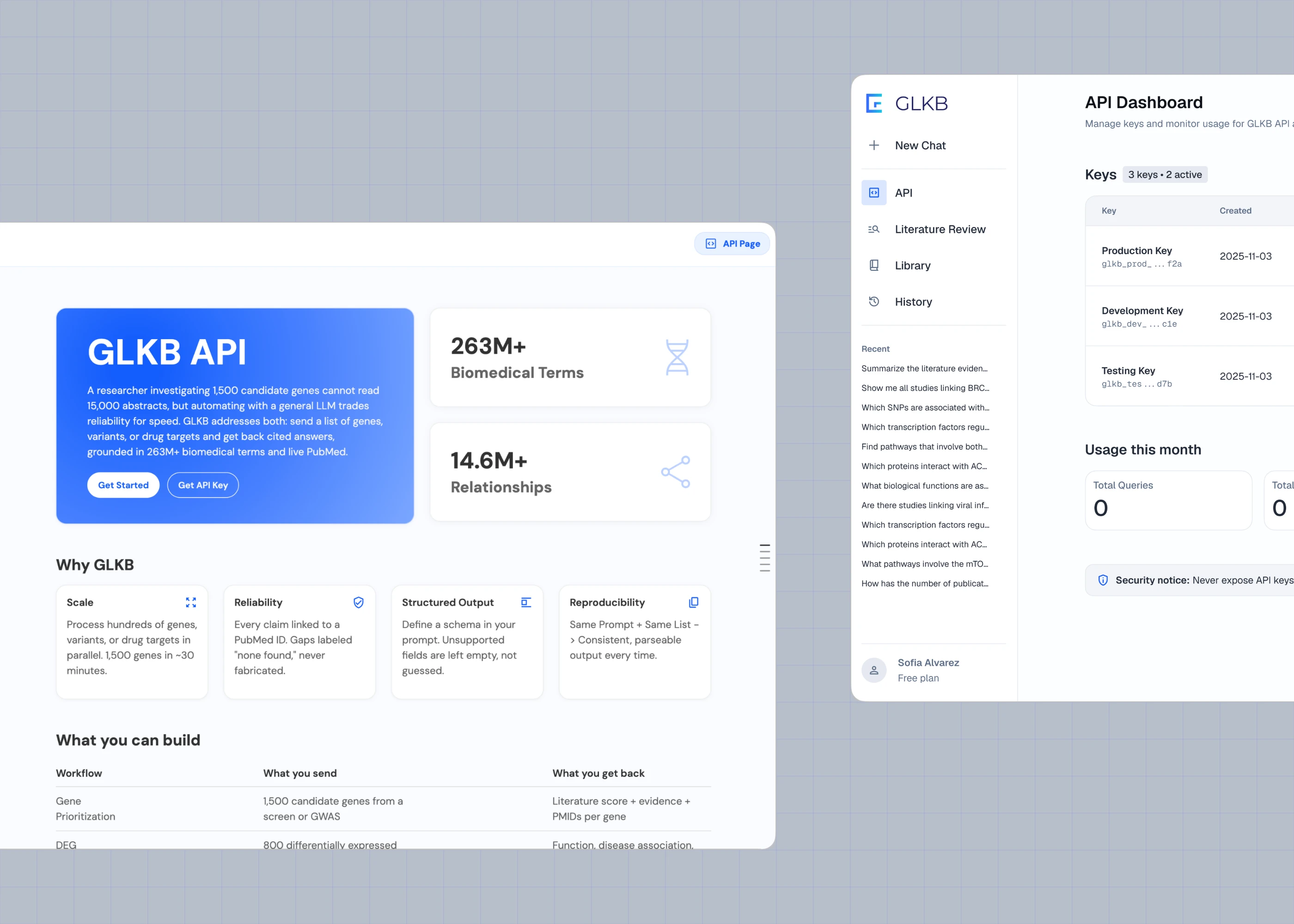
The front page is the source document's argument, re-cut and kept. Four cards under Why GLKB — scale, reliability, structured output, reproducibility — compress four of its sections into a sentence each. Beneath them, What you can build turns its four worked tasks into three columns: the workflow, what you send, and what you get back. That table is the first thing on the page that is not in the document. The hero above it went through a long run of treatments — the card in blue, teal, purple and gradient, a statistics panel in and out, one version centred rather than left, and late versions with no coloured card at all.


The argument stays at the top because somebody deciding whether to use an API is being persuaded. The reference is one click down because the same person tomorrow is not.

Six versions of the same GLKB API front page shown three across and two down, each cropped to the identical region: the hero card in flat blue, three gradients running out through teal and purple, a pale blue, and one with no card and no statistics panel at all. The four Why GLKB cards beneath are identical in every one.

One screen drawn again and again with a single variable moving each time: the colour of the hero card, and in the last run whether there is a card at all. Thirteen versions on one board — one flat blue, seven gradients that go out through teal and purple, five with no card and no statistics panel beside it. What never moves is the argument underneath: the same four cards, in the same order, in every one.


Site Map: Flatten Onto a Page or Nest Behind an Index


I drew five site maps, each carrying the identical sixteen-item content outline, so that the boards isolated exactly one variable: how much of the outline flattens onto a page versus nests behind an index. One long page with jump links; four sectioned pages; one page with eight sub-sections; an index to four pages; an index to eight.


Every one of the five capped out at eight pages. My own earlier blueprint had proposed twenty. What shipped is twelve, in four groups.


Five of the twelve are use cases — the largest group, and more than twice the endpoint reference. The person pushing a gene list through a script needs to know what to ask the graph before they need to know how to authenticate to it.

Five site-map option boards drawn at one scale on a dark ground, each showing the same sixteen-item outline, above a labelled axis running from everything on one page to everything behind an index, with the twelve-page site that shipped set apart at the right.

The five site-map options as they were drawn, each carrying the identical sixteen-item outline, then the twelve pages that shipped in their four groups. The five run from everything on one page to everything behind an index and none of them goes past eight pages; the sixth, at twelve, sits off the end of the range.


Search: Results Need Room, Not a Rail


I did not specify this one. It went to build as a line in the sidebar, and the sidebar could not show a result — there was no width for one. So it moved.


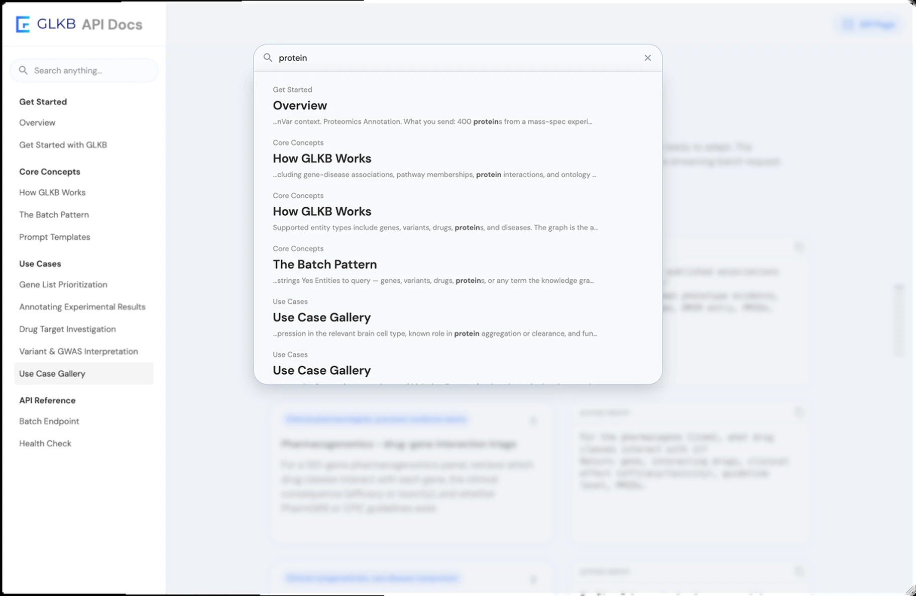
What it moved to is a panel over a dimmed page, and the reason is the shape of a single result rather than the number of them. A result here is three lines: the path through the sidebar that reaches the page, the page's own title, and the sentence the term was found in with the term set in bold. A navigation rail can carry a title. It cannot carry the sentence, and without the sentence the reader is choosing between twelve page names instead of twelve answers.

The GLKB documentation search overlay shown as a component and then set over the dimmed page, with each result carrying three lines: the sidebar path, the page title, and the sentence the term was found in with the term bolded.

The overlay as a component, then set over the page so the dimming can be judged against real content. Each result is three lines — the path through the sidebar, the page's own title, and the sentence the term was found in with the term bolded. A navigation rail can carry the title. It cannot carry the sentence.


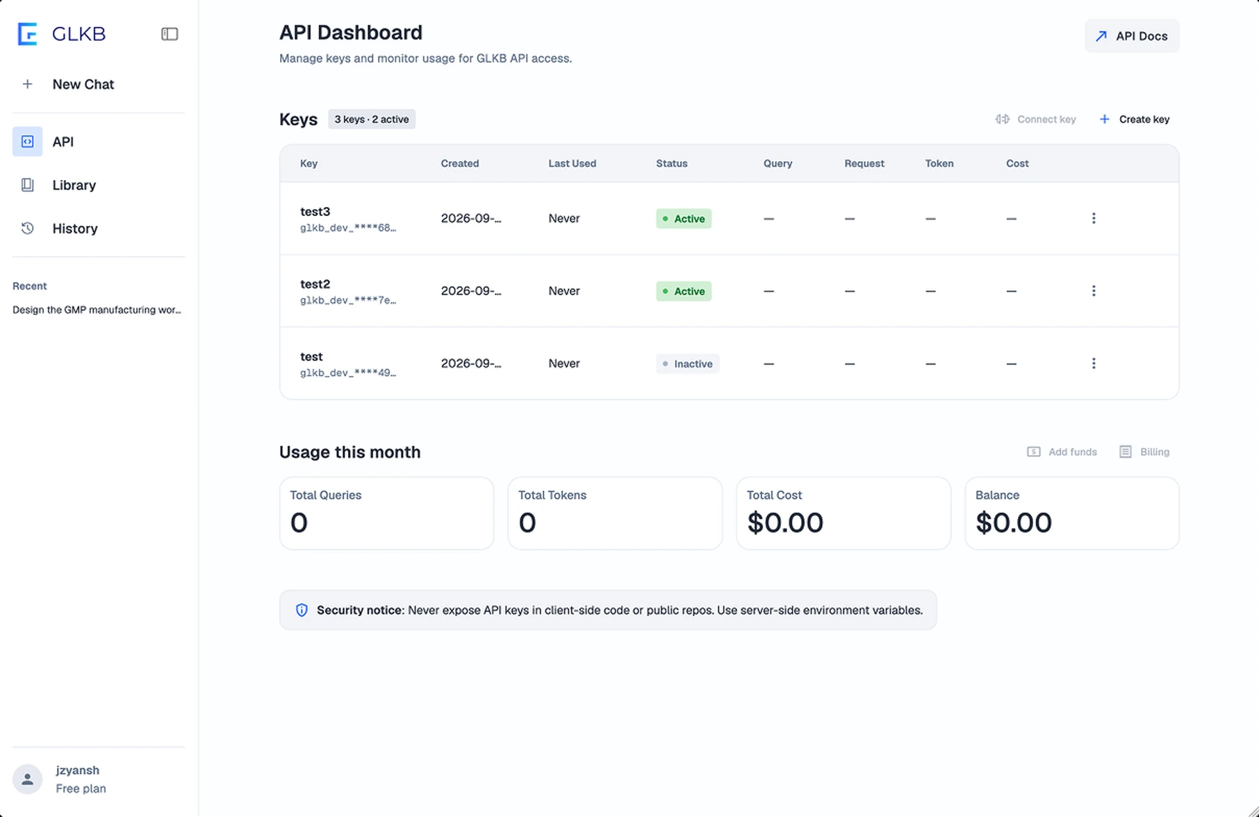
API Dashboard: When Tabs Divide a Single Table


This was the last thing I did there. By then I had rebuilt the design system, and the brief was to take the user experience of every page in the product.


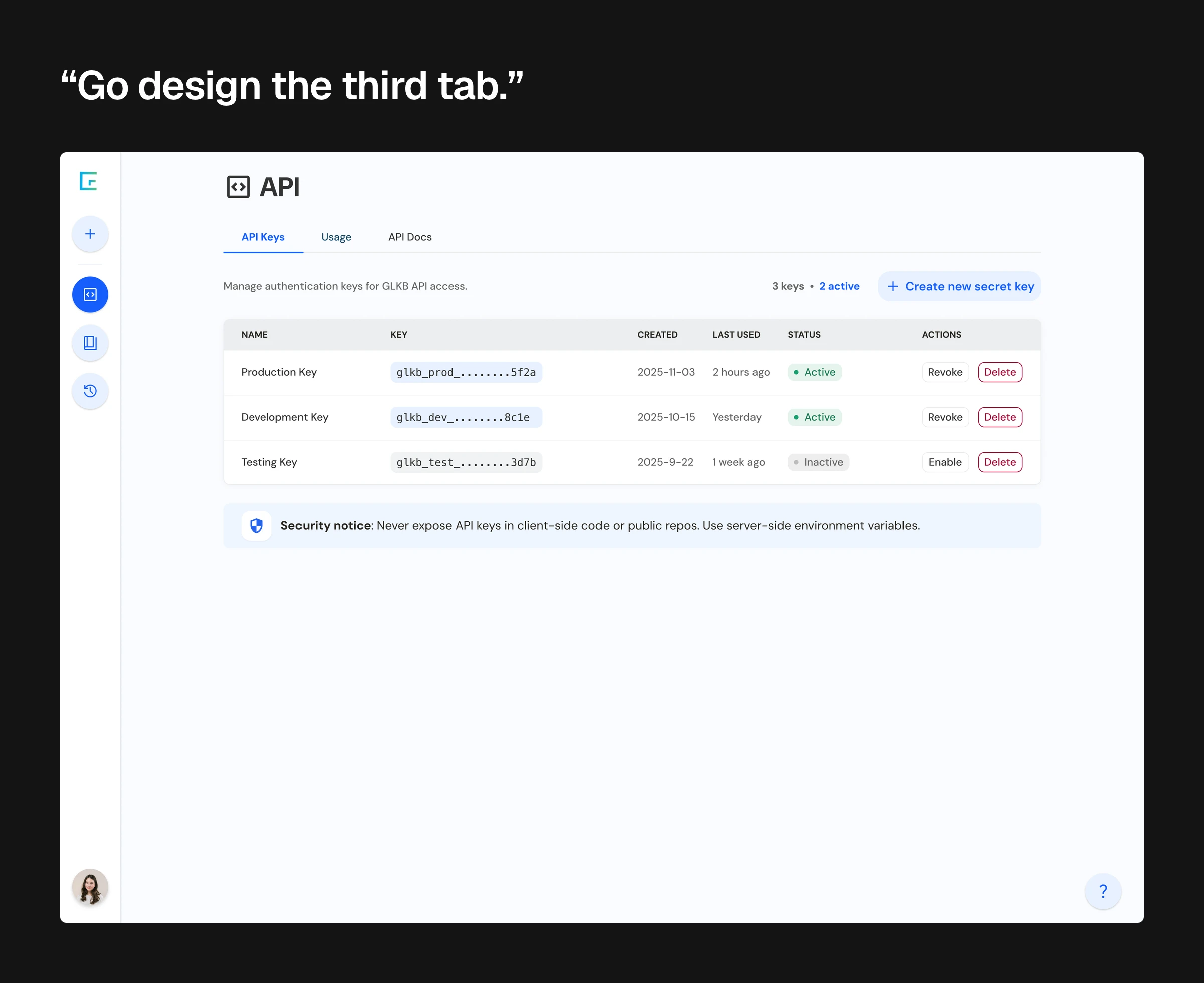
The API screen still had its three tabs. One of them had been empty since the documentation left. Of the two that remained, both showed a table keyed on the same items, differing only in which columns they carried. I proposed no tabs at all — one screen, everything on the surface — and it was agreed immediately.


Then I went further than reorganising. From running my own keys against somebody else's models on a side project that summer, I knew that the number you actually want is what all of the keys cost you together, not what each one cost — so the per-key cost column got a combined panel under it, instead of leaving the reader to add the column up.

One developer console at three stages — a masked key list, the same list with a documentation link added, and a renamed dashboard carrying per-key usage, cost and billing columns whose totals read zero.

The same surface three times, aligned at the top of each frame. The tab row survives the first two and is gone in the third; the columns go the other way, from six that describe the key to eight that include what each key spent. Read left to right it is a key list becoming an account. The keys table with its usage columns is live behind sign-in; the funds and balance controls beside it are designed, not built.


The Reference Layer: A Specification With a Third State


The half the source document did not have is a specification, and it is specified the way a specification is: parameters get a table — name, type, required, description — with the defaults and the ceilings printed rather than narrated, so concurrency reads parallel runs, default 5, max 50 instead of up to 50 parallel agent runs in the middle of a paragraph. The streaming response gets a field table per event. Two pages exist for the two things the document only gestured at: the endpoint, and the health check.


And then the third state, which is the part I would show anyone. Three things were not settled when this had to ship: the production base URL, the name and format of the authentication header, and where the user identifier in the endpoint path comes from. Those are the same three the source document had left open — its address is a placeholder, it sends no authentication at all, and its path carries an identifier it never explains.


So I put each one into the deployed build, as a comment on the line it blocks. A developer reading the quickstart meets the open question at the point that stops them, instead of finding it in a list afterwards. The three are in the deployed build and in none of the source files.

Two code panels: on the left the local source file, labelled as carrying none of the markers, and on the right the deployed page with three # DEV comments sitting on the lines they block, with the three blockers spelled out beneath.

The quickstart as deployed, with three unresolved fields marked in the code rather than in a note beneath it. Each comment sits on the line it blocks — the address, then the path, then the header — so the gap arrives at the moment it stops you, which is the only moment a caveat is worth anything.


Impact


The documentation site is deployed to a development host behind a password: twelve pages in four groups, drawn as finished pages rather than a template and a content list, from 1,067 lines of drafted content, with a persistent sidebar, the search overlay, parameter tables and copyable code blocks. The two surfaces point at each other — the console carries a button out to the site and the site carries one back into the product. The API Dashboard is live on glkb.org behind sign-in, and on the shipped page the tabs are gone.

The GLKB developer dashboard: one keys screen with no tab row, three keys listed across eight columns including what each key spent, with the create-key and save-key steps shown beside it and the funds and balance controls drawn in dashed outline as designed but not built.

The last thing on the surface and the climax of the entry: one screen where three tabs were. Three keys, eight columns, and the combined spend read off the whole account rather than summed in the reader's head. Creating a key is two steps because the key is shown once. The funds and balance cluster is outlined because it is designed and not built.


I had the right instinct and I spent it as a parenthesis


On the second day I was told the documentation went under the third tab, and what I said was that it was a curious decision — and then sure. I built it there. Four months later I stood in front of the same screen and said that the third tab should not be a tab, and that time it was agreed the same day.


The idea did not improve in between. It is the same idea. What changed is that the first time I offered it as an aside and the second time I brought a case — and what made the case possible was four months of the product manager watching me do other things.


The aside cost two days — a full pass of the document laid out inside a panel it was never going to fit, thrown away when the instruction reversed. It cost a summer in which the developer documentation lived at an address the product had to explain.


The version of that argument I made on the second day is not in any file. It was half a sentence, and I let it go.

Credit


Product manager — Zhiyuan Liu


GLKB — Zhaowei Han, the PhD student who led GLKB


Agent team — Xiang Zhang


Front end — Bing Han


Lab — Jie Liu Lab, University of Michigan