GLKB Investigate
When an agent thinks for 15 minutes.
Company
GLKB · Jie Liu Lab, University of Michigan
My Role
UX/UI Designer
Tools
Figma · Claude Code · React · Claude Design
Timeline
Jul – Aug 2026
Description
GLKB is an AI-powered research engine that synthesizes biomedical literature into answers grounded in real publications. Investigate is its deep-research mode: ask one question, and an agent reads the literature and composes for 8 to 15 minutes before it answers.
Context
I designed the 8 to 15 minutes a research agent spends thinking, from the only thing I had been given: the answer it produces at the end. A developer built that design, and then the one after it, and both were wrong. The work was never on the canvas; it was on the seam between the backend and the screen. I mapped each run into 15 keyframes and designed what the screen is allowed to say at each one.
Investigate is live on glkb.org.
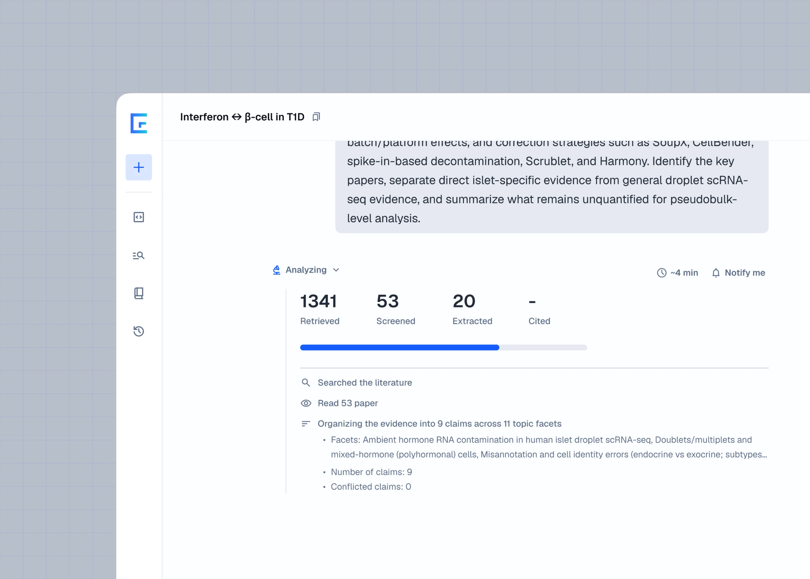
I designed Investigate end to end: the run interface, what it says at each stage, the report structure and the reference layer. The pipeline is the agent team’s, the front end is Bing Han’s, and the feature was the PM’s to shape.
One sample answer, and “it’s gonna run long”
That was the brief. Everything about the product happens in those “long” minutes, and neither of the two things I had been given contained any of them.
Researchers are the last audience to extend credit to a screen that has gone quiet, and GLKB’s whole promise is that a model’s claims can be checked against citable literature. Three things pulled against each other: the run takes minutes, and its real numbers arrive late and out of order; it has to live inside an existing chat column without becoming a second application; and the progress display cannot be the part that lies.
I drew a countdown for something that cannot be counted
I asked the agent team for time and was told everyone was too busy. So I read the answer, took it apart, watched four other products run, and drew the wait as Figma frames. The PM asked for a notify-me, a progress bar and a countdown, so I drew those too.
Bing, the front-end developer, built it and came back with a question I could not answer: the content and the steps were wrong, not just the pixels. The PM looked and said “yo that looks bad.” I looked and agreed. The agent’s own tool-call strings had reached the surface where a researcher would read them. I never drew those, but I never said not to.

We told him to hide the tool calls, and that the timing was off. It came back a second time with the tool calls gone and nothing in their place: there was no content for those minutes, and no front-end work makes content out of nothing. I left the door open, and he built exactly what I gave him, twice.
It was never UI work, and not even only UX work. I had been designing the shape of a process I had never seen. The countdown is a promise nothing inside the run knows enough to make.
Reading 53 papers takes as long as reading 53 papers takes
So I asked the agent team for the chain. It was the first time I had seen what actually happens inside one of these runs — not just in this product, in any of them. Nothing was broken. The vacuum in the middle of the run was not a gap in the interface. It was the work.
The screen cannot sit empty across minutes in which nothing has been measured, and what it says has to be true. I broke the run into keyframes and asked the same three questions at every one: what has the front end been given, what is it waiting on, and what should it be showing.
The counters are invented. Each starts climbing when the work that will produce it begins, on a curve built so it cannot reach the true value, and locks to the real figure the instant the backend states one. The number is a guess; the moment is not.
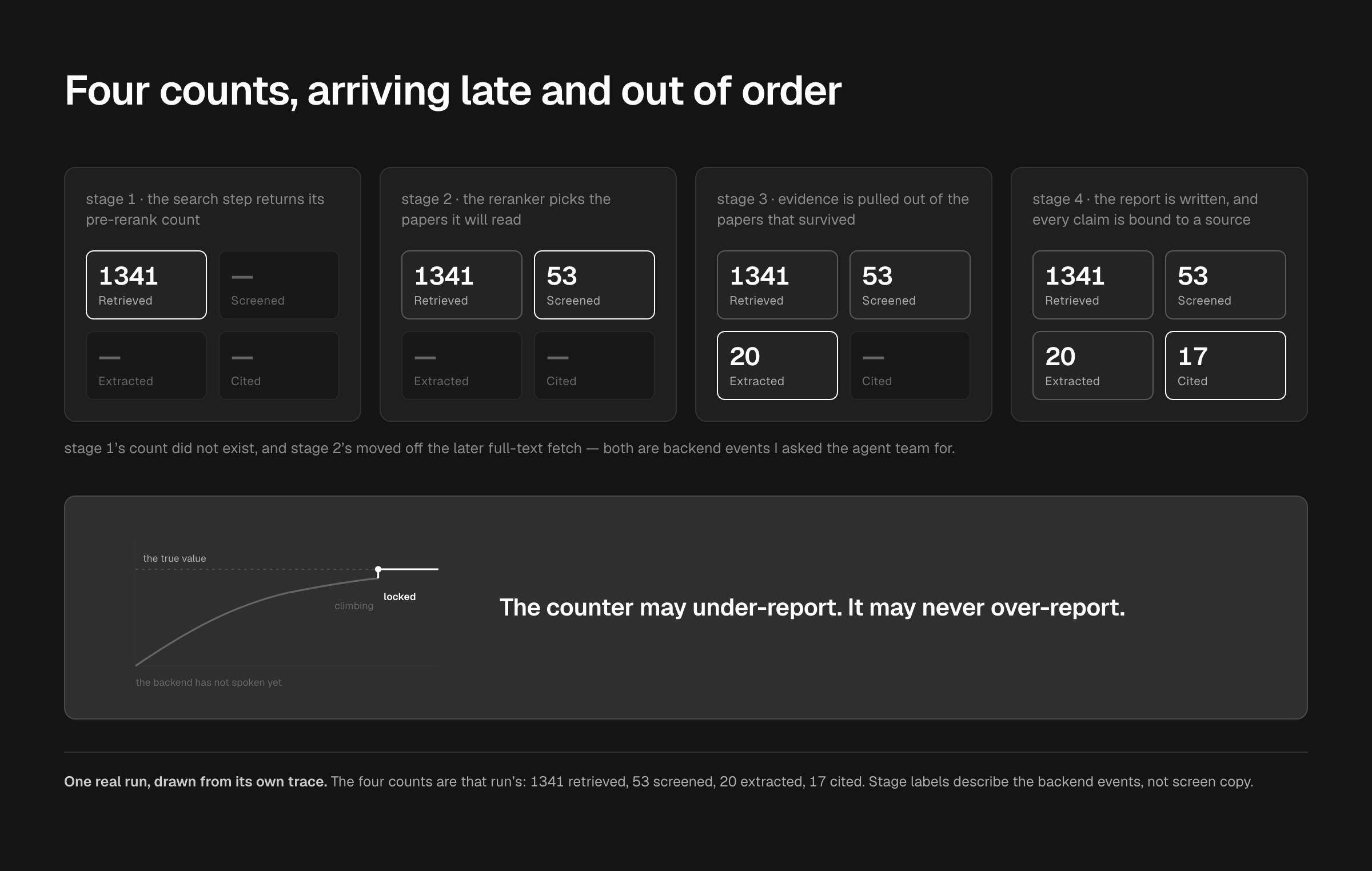
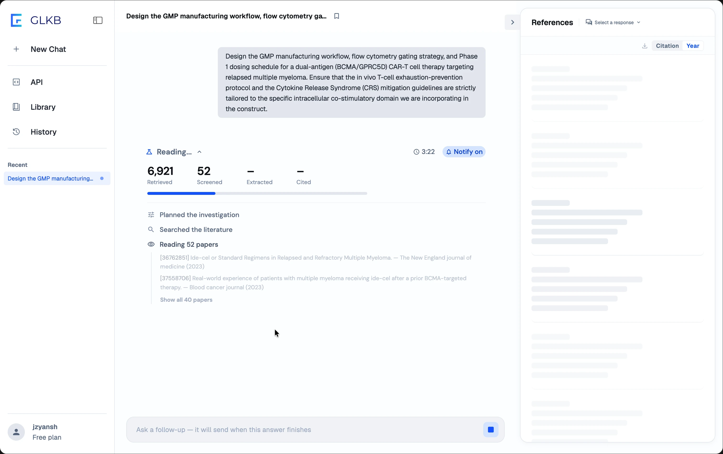
The same three questions decide what may be shown, and the answer changes minute by minute. At the reranking step the list of papers exists; what the agent concludes from them does not, until it has read them. So the longest stretch of the run is filled with the papers themselves, rotating two at a time, with no claim about what is in them. That needed the list sent alongside the count, and it was not — a requirement that falls on the backend, not on the interface.
15 keyframes across 10 stages. The prototype builds 14; the fifteenth is the answer arriving, which ends the run. One fires on a pause rather than on data, because the interface needs a rule for when nothing has arrived. The duration appears exactly once, at the very end.

The Outcome: What the Product Says While It Is Thinking
Everything below shipped: the run interface, a question the agent asks in the middle of a run, and the reference layer under the answer.
The language follows the same rule as the numbers. Present tense while a stage is open, past tense the moment it closes, and nothing discarded. A finished stage folds behind its own summary line instead of scrolling away.
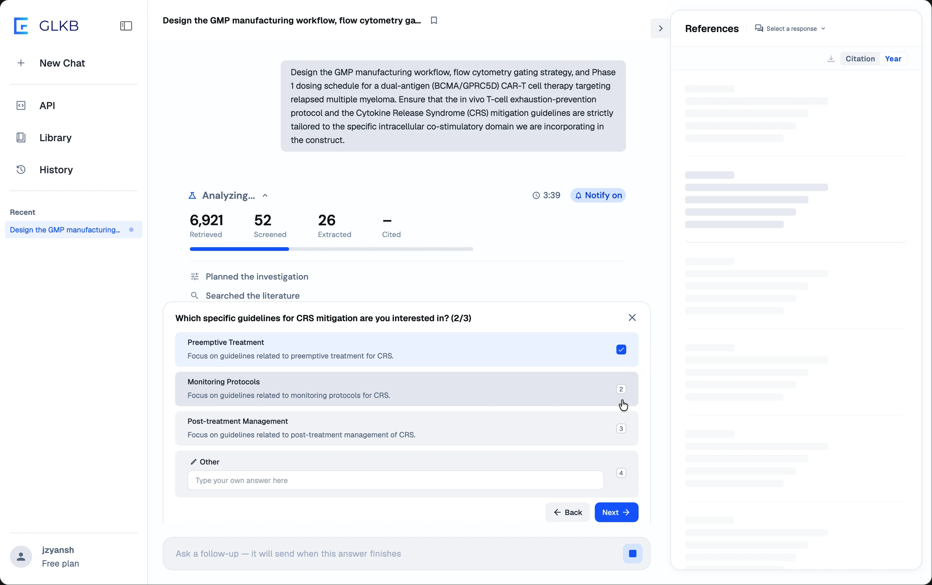
The Clarifying Question: Interrupting a Run Already Burning
The agent stops and asks you a question. I proposed it and won the PM and the backend over to it. An underspecified query puts one to four scoping questions in front of you: some before the run commits, some in the middle of it, when the ambiguity only shows up once the agent is reading. That second case is the interesting one: interrupting costs something, and so does spending eight minutes on the wrong reading of the question.
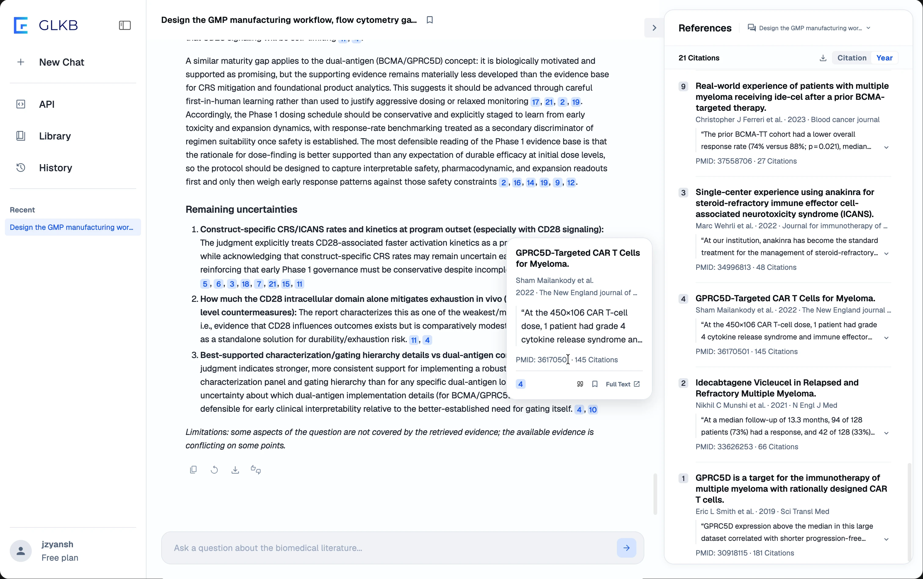
The Reference Layer: Making a Citation Cheap to Check
Each response filters to its own references, sorted by citation count or by year. Any claim in the answer expands to the sentences it was drawn from: the inline marker opens a card carrying the source sentence, and the matching entry sits in the panel beside it, ready to bookmark or cite. A reader gets from a sentence in the answer to the sentence in the paper without leaving the page, which is the only test of a citation that decides anything.
Impact
Investigate is live on glkb.org, where the platform is in use by more than 50 researchers across Michigan and four outside institutions. One real run: 6,921 papers retrieved → 52 screened → 26 extracted → 21 cited. The progress interface, the counters, the mid-run clarifying question, the report structure and the reference layer are all live. The notification work is in: the in-run control and the completion email are both shipped. The email still prints the report’s Markdown unrendered, which is in the picture below.
![A desktop mail client with one message open, the list filtered to the sender noreply@glkb.org. The message is from GLKB noreply, addressed to Junzhe Yan, filed in an inbox and dated September 3, 2026 at 1:23 PM, with the subject line beginning [GLKB] Your investigation is ready and continuing into the question. The email itself carries the GLKB mark, a heading reading Your investigation is ready, the question restated under the label Your question, a View full report button, the line Run completed Sep 3, 2026, 1:23 PM, and a result card printing the question in full above four counts — 6921 retrieved, 52 screened, 26 extracted, 21 cited — over the opening of the report text.](https://framerusercontent.com/images/kjBrjXAj8PN9KFvl2W0ex3uuJHM.webp?width=3024&height=1898)
The smallest thing I designed was not a frame
I had been treating the screen as the part I could change and the backend as the part I had to accept. It runs the other way more often than a designer expects: an interface can only say what some event lets it say. Two of the events I asked for exist in the product. The one that would have filled the longest minute still does not.
Credit
Product manager — Zhiyuan Liu
Front end — Bing Han
Agent team — Xiang Zhang
GLKB — Zhaowei Han
Lab — Jie Liu Lab, University of Michigan