SwallowCare
The app asks how it went, not how much.
Company
SwallowCare × Georgia Tech MS-HCI
My Role
Lead Product Designer
Tools
Figma · Qualtrics · UserTesting
Timeline
Aug – Dec 2025
Description
A daily-adherence app to bridge the gap between clinic visits for people with dysphagia, a swallowing disorder where skipping days costs you not a subscription but the airway.
Context
I argued with my clinical sponsor about where patient education belonged, and I lost. Building the centralized library showed us we were both answering the wrong question: nobody had defined what the product was for. The answer was neither her shelf nor my scattered tips. Education, diet and exercise had to select for one patient — the project’s one-size-fits-one principle. 15 weeks of design and research with a practicing SLP (speech-language pathologist), handed off. Nothing was built.
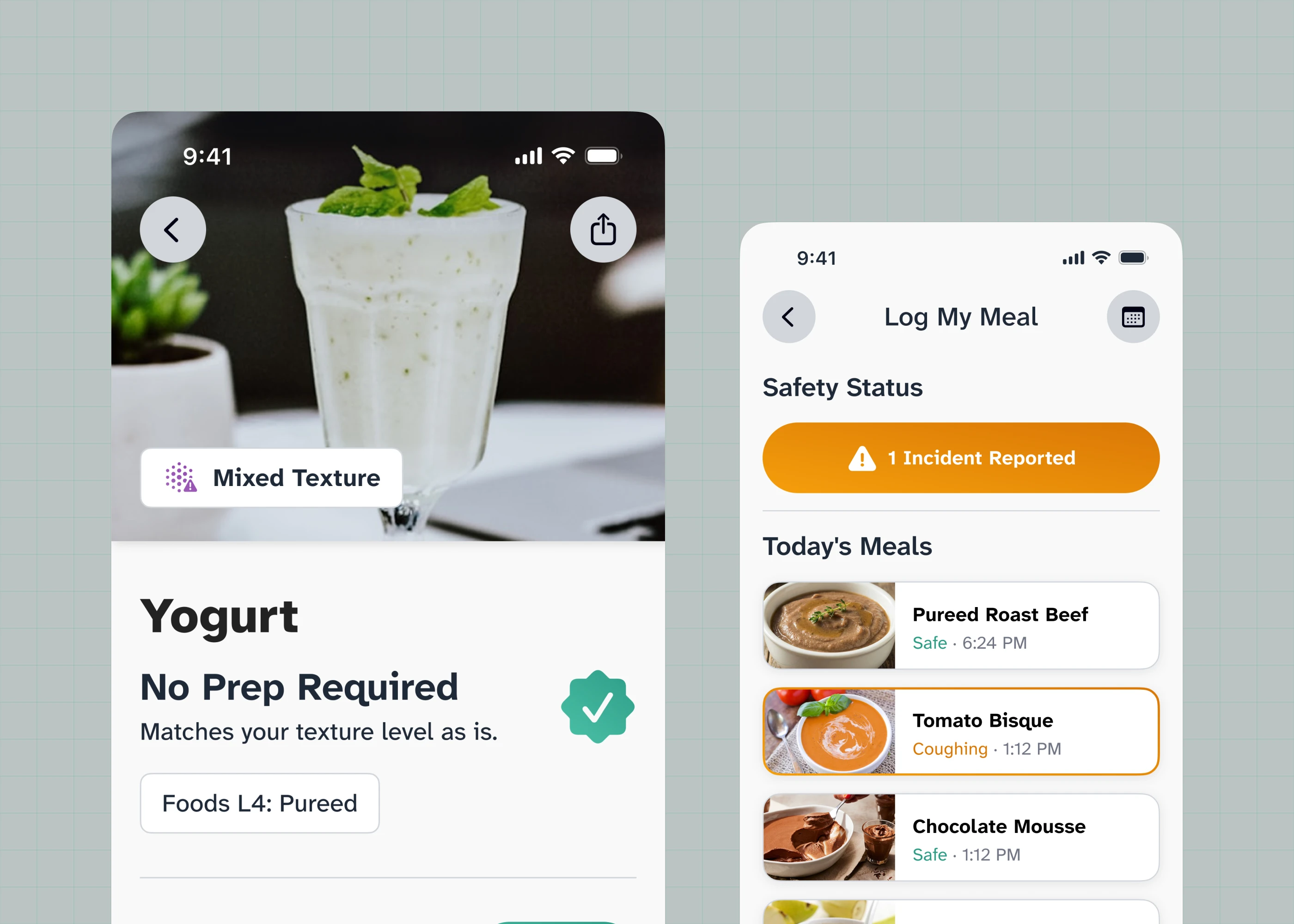
I built the wireframes, the flows, the assistant, the clinical content system, the accessibility system, and the prototypes both evaluations were run on. The primary research, the concept ideation and the user testing were a team effort.
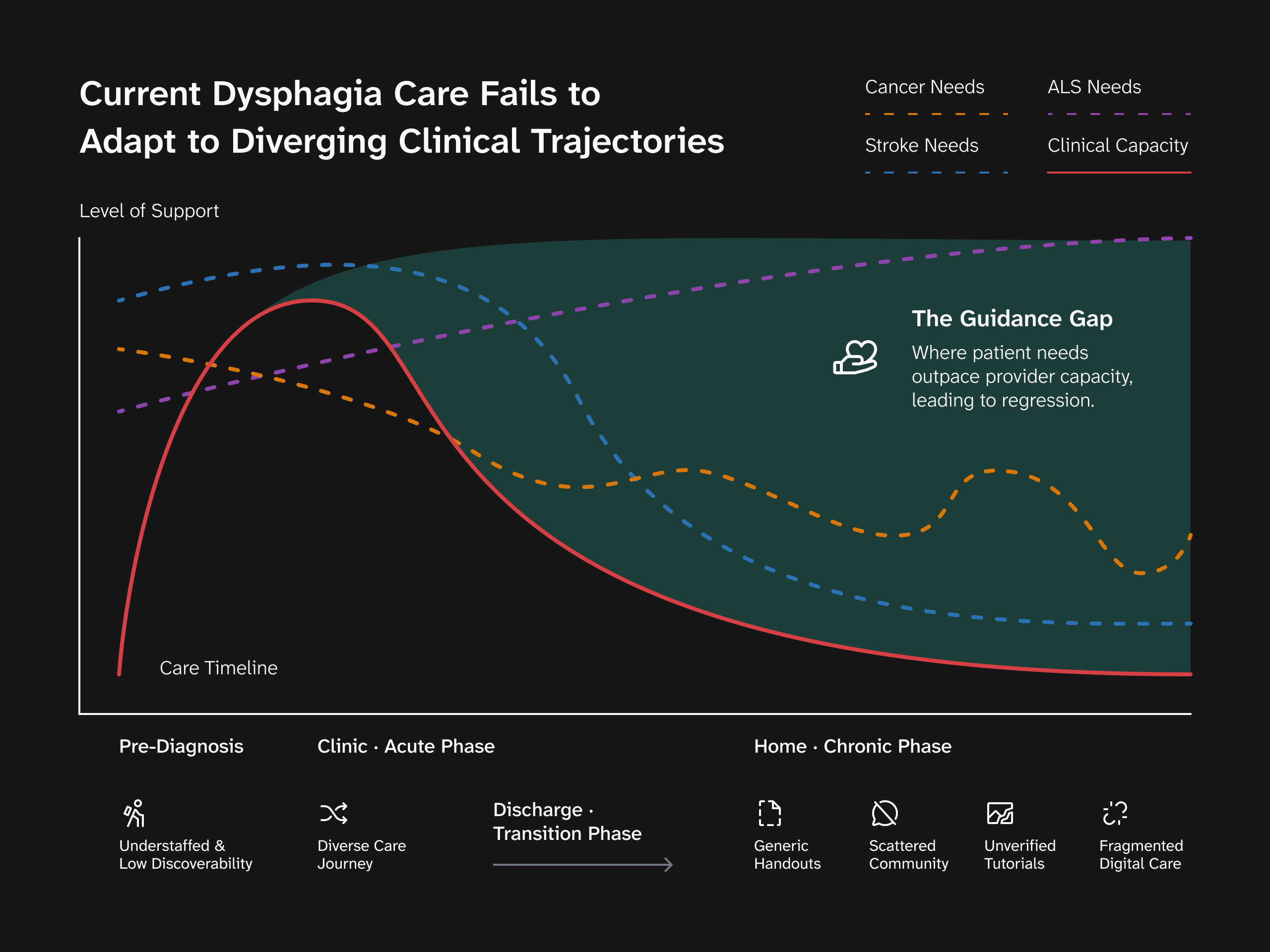
Managed at home, by the person least equipped to judge it
Dysphagia is difficulty swallowing, and getting it wrong means food or liquid entering the airway. Managing it is daily and unglamorous: exercises, a restricted diet, self-monitoring, all at home between clinic visits. Across 11 interviews, a 27-response survey and five diary studies, what kept returning was not that patients could not follow a maneuver but that they did not understand why, and the gap is different for every patient. Most are elderly, some cognitively impaired.
The feedback was warm, and warm was the wrong temperature
Then we did the obvious thing. We are the generation that reaches for gamification, so we proposed a mascot, streaks, and a buddy. People liked it, and that nearly cost us: “that’s interesting, that’s fun”, bracketed every time by what is it, and what is it for? One SLP ended it: “If a mascot can do Mendelsohn Maneuver I would be impressed.” The feedback was neither positive nor negative. It was that we were off the point.
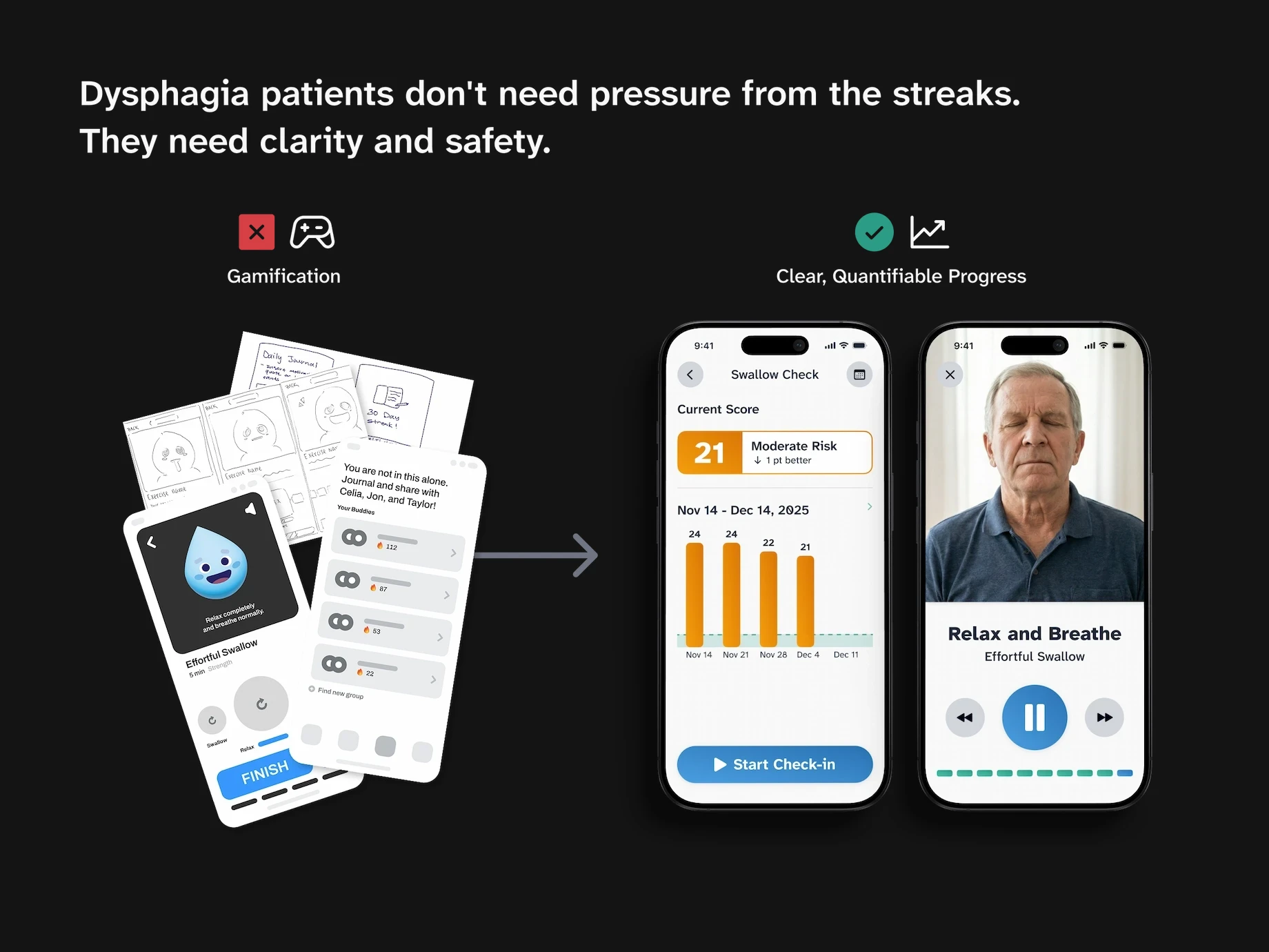
A character that cannot demonstrate what it is standing beside is decoration, and decoration costs comprehension here. Cutting it took the product’s character out with it. In its place: demonstration footage of a senior the age of the patients, filmed somewhere domestic rather than clinical, and the EAT-10 where the streak had been. Both for the same reason: clarity.
The argument I lost was about the wrong thing
Education came at us from two directions: the research pointed at it, and Rinki, our clinical sponsor, asked for it outright. We proposed dissolving it into the product, bite-size, at the point of use. She pushed back hard: education was not a garnish but the point of the product, and scattering it made it something a patient could only meet by accident. I lost, and we built her library.

Building it is what broke the problem open. Partway through I said it out loud to my team: “I don’t know what the app is for anymore.” One side of the file was a daily loop: log a meal, run an exercise, watch a score move. The other was a shelf of articles connected to none of it. We had been arguing about where education should sit. Neither of us had said what the app was.
The library became the second tab, opening on my symptom, my diet, my exercise: this patient’s level, not the condition’s. I never went back and told her she was wrong about centralized education, because she wasn’t. No one size fits all — only one size fits one. That idea is what the whole product is built on, and it came out of an argument I lost, not out of the research.
Nobody in the room asked what it was for
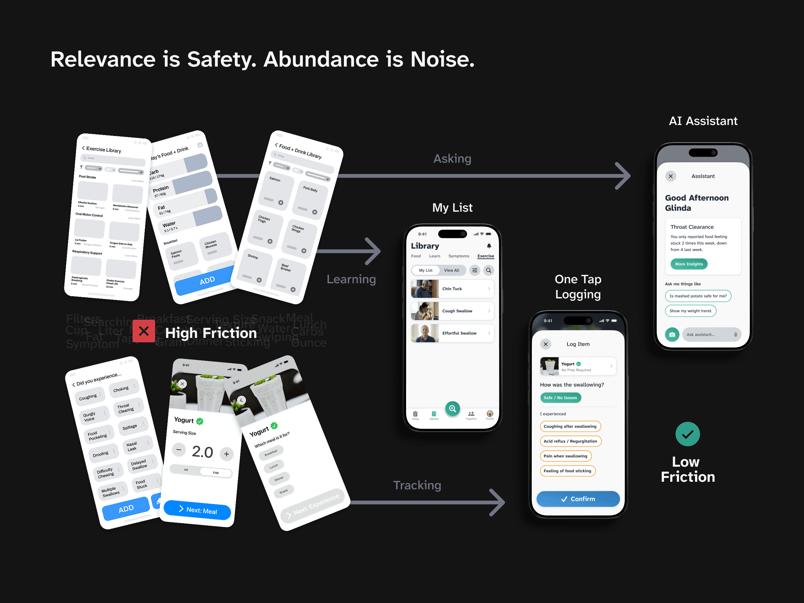
The product has a diet log, so we benchmarked eight diet apps on a rubric and learned from them blindly. A serving-size stepper sat inside an 11-state logging flow, and a calorie ring sat on the dashboard. Clinicians liked it. Patients liked it. In no session did anybody ask what it was for. Then a senior product designer from outside the team needed one pass: “Why am I logging portions… I thought it’s a dysphagia app.” He counted it: calories were named three times on the logging screen, the patient’s own symptom once. 11 states became six, ending on the swallow, and the ring came off.
The Outcome: One Size Fits One
Two patients on opposite trajectories need opposite things from the same app: one compensating around permanent change, the other rehabilitating toward a return. Averaging them is the failure, not the price of serving both.
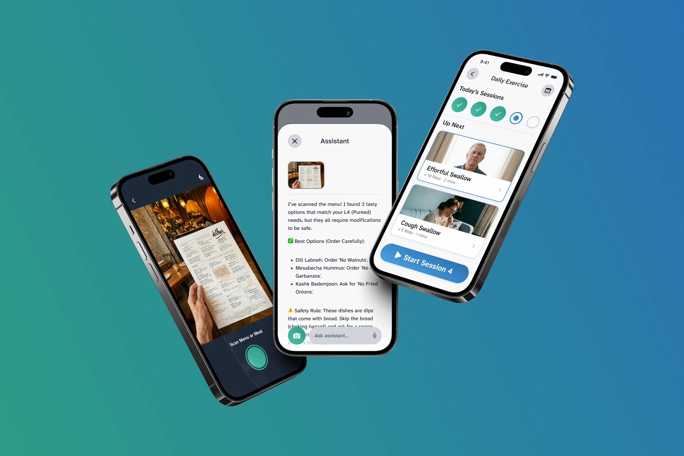
Daily Plan and Video Guidance: Practicing Correctly With Nobody Watching
Patients leave the clinic with a paper handout and weeks until the next visit, and a static diagram cannot specify a throat maneuver. The stack of paper became a daily checklist and a video guide performed by a real person. A session cycles a coach cue over the video once per repetition, then a timed rest, then the next maneuver. The written instructions sit alongside at body size, for anyone who cannot use the video.

The Safety Loop: Prediction and Verification
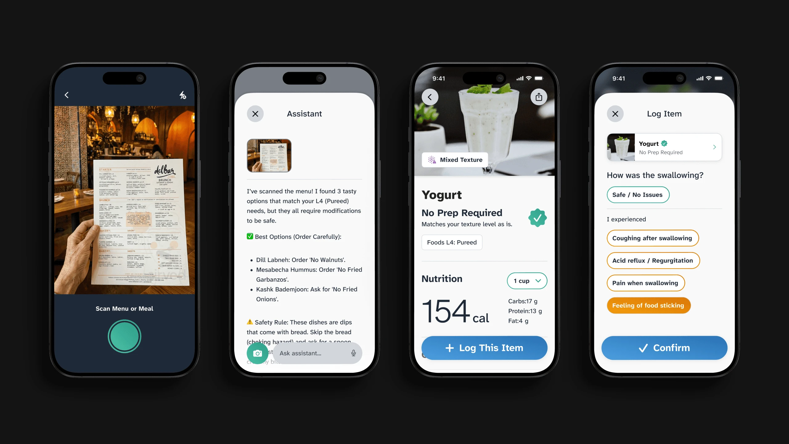
Two questions decide whether a meal goes well, and standard food apps answer neither: is this safe for me before eating, and after eating, was it. The assistant and food catalog answer the first against this patient’s own IDDSI level, splitting the verdict inside a dish where it has to: on a lemon tart the smooth filling is fine, the dry crust is a major risk. It is not asked to say yes or no, but to say what to change. The diet log answers the second, every entry ending on “How was the swallowing?” What the assistant reads next week is what the patient reported this week. Calories are still the biggest number on the food’s detail card, one tap before the log. I would take that further now.
Quantifying Recovery: Clinical and Social Visibility
Recovery between visits is invisible to the clinician, and a self-reported streak is not a measure of it. The EAT-10 is implemented straight: all 10 items, the published threshold, no score of our own. The assessment feeds a longitudinal Swallow Score and a weekly report that reaches the appointment as data rather than recollection. Beside it, a light community layer, kept because isolation was the most consistent thing patients described. A buddy compatibility score was designed and did not carry forward: peer support kept, competitive measurement cut, inside the same screen.

Design System: Aging Vision and Color-Coded Risk
An elderly, sometimes cognitively impaired audience and a signal carried by color pull against each other, so the system is specified where they collide. Body text is Atkinson Hyperlegible Next, a low-vision typeface, at 18 and 24 pixels. Four semantic colors do two jobs at once, naming what they signal and carrying the brand.

Impact
In moderated testing with five users, all five completed onboarding and all five completed diet logging. The exercise flow succeeded for two of five: two hit an error, one was unsure. The flow that failed is the practice session above, the one I had just rebuilt around a real person instead of a character. A single blended percentage would have hidden that. The engagement closed on a full research and design handoff.
Those numbers belong to the version tested that semester. The redesign I did alone after the course has not been in front of a user: the six-state logging flow, the dashboard with the calorie ring taken off.
Everyone liked the part I had got wrong
I had put those numbers there by copying, from a category of app whose users are counting what they eat, into a product whose users are trying not to aspirate it. The mascot I caught myself, out of feedback that was warm and off-target. This one I never caught at all. It had been designed, tested and admired before somebody who had never seen the file needed one sentence to end it.
Credit
Team — Riley Liu, Raj Sureka, Emily Jeong
External partner — Dr. Rinki Varindani Desai
Special thanks — NFOSD, Ed Steger, Dr. Carrie Bruce, Kiki Marlam
Thank you also to everyone who took part in our research and evaluation sessions.