YOW.tv Onboarding & Auth

Most of this flow is what goes wrong.

Company

YOW.tv

My Role

Product Design Intern — first designer hired

Tools

Figma

Timeline

May – Jun 2026

Description

YOW.tv is an indie-film streaming platform. I was sent its new splash screen, and found the account system standing behind it.

Context

I was sent a splash screen as a Photoshop file, with permission to blow it up if I hated it. It was not a splash screen but sign-up and sign-in for a product that already had users and a database, and most of the design in it was already settled: by Google, by Apple, by a compliance line nobody had flagged, and finally by the database. Ten of the twenty-five screens I specified are error states. It is live on the App Store; the build is the development team's.

A student designs the ideal flow; a product designer designs the one that can exist

I was the only designer on this: the audit, the type and radius testing, the flow, every screen and every state, the copy, and the handoff. Greg, the branding director, owns the brand it is drawn from and made the final call on the typeface. Contus, the development team at the time, built it. Handoff and everything after it ran on Basecamp, shared with them and with our own team.

Two buttons on a splash screen are an account system


The email came from Joey and Brian, the founder and my boss. They had a new mobile splash design, they wanted whatever changes I thought would help, and, in their words, I could "blow the whole thing up and start from scratch" if I hated it. Attached was a Photoshop file: a poster collage under a dark scrim, Stream indie. over Free. set enormous, the wordmark, and two square-cornered buttons inset from both edges, reading CONTINUE AS GUEST and SIGN UP FREE/SIGN IN.


Those two buttons are the reason the brief was wrong about its own size. A splash screen is a picture. Two buttons that say sign up and sign in are an account system: an address to collect, a code to check, a way to fail each of those, a returning person who must not be greeted as new, and a guest who never gets an account at all. YOW.tv already had every one of those running, with people inside them, and I had just found that the licensed typeface was not loading anywhere in the product and the system fallback was rendering it. So before I drew a screen I tested the two most basic things an interface has, a typeface and a button. The founders have a strong visual sense and are not designers by trade, and none of this was going to be settled by description.

One unretouched phone capture of the founders' splash screen mounted on a flat slate ground and labelled the file as it arrived: a film-poster collage, the words Stream indie. Free., the YOW.tv wordmark, and two buttons reading Continue as Guest and Sign Up Free / Sign In.

The file as it arrived, unretouched, at full height. The artwork, the tagline and the wordmark are finished; under them are two buttons with nothing behind either — the brief and the problem in one picture, because what is behind those two buttons is an account system.


I redrew it twenty-six times and they chose the closest one


Permission to start from scratch reads like an invitation, so I took it as one. I drew twenty-six splash layouts by hand: wordmark above the line and below it, the tagline small and the tagline enormous, buttons stacked and buttons reduced to a row of three circular icons, versions that opened with a phone number and versions that opened with an email, versions carrying three lines of value proposition and versions carrying none. Then I put the whole run in front of the team and asked which one.


They chose the one closest to the design they had sent me — not a compromise between the options, but the composition that was already theirs, tagline large over the collage with a single primary button beneath it. What I had read as an invitation to replace their design was an invitation to improve it. Twenty-five of the twenty-six were how I found that out.

Twenty-six splash-screen layouts on one dark collage in six clustered groups, varying where the wordmark sits, how large the tagline is set, and whether the sign-in row is a stack of slabs or a row of small icons; one layout carries a yellow outline.

Twenty-six layouts on one collage, in the six groups the board drew them in, where the mark sits, how large the tagline is set, buttons as slabs or icons, whether a phone field comes first, and how much the screen says before it asks for anything. The chosen one is marked.


Two of the buttons were never mine to design


I assumed the sign-in row was a design problem. It is the densest strip on the screen — two marks, two labels, a weight, an order, and a relationship to the primary button above it — and I had never drawn one.


It is not a design problem. Google and Apple both publish branding requirements for their sign-in buttons and both supply the artwork, and what they specify covers the mark, the wording, the proportions and how much clear space the thing is owed. You do not draw that button. You read the document, take the asset, and place it. It was the first time I had designed a screen with somebody else's component sitting inside it, and it moved the work to what was left, which is smaller and more useful: which of the two appears on which platform, where the row sits relative to the primary button, and what it does to the guest link underneath. The iOS splash carries both marks. The Android splash carries one.

The iOS and Android splash screens side by side, with the one row that differs between them enlarged beneath: iOS carries both Continue with Google and Continue with Apple, Android carries only Google.

The two splashes and, enlarged, the row that differs. Google and Apple publish the branding requirements and supply the artwork, so the row is placed rather than drawn — what is left to design is which mark appears on which platform, and what the missing row does to everything under it: the stack stays bottom-aligned, so the Google row moves into the slot Apple had and the tagline drops half a row with it.


The Outcome: twenty-five frames, ten of which are something going wrong


What I handed over is twenty-five frames of a sign-up flow, ten of them error states, and a document telling a developer when each one appears and when it goes away again. The rest of this page is those.

Four YOW.tv onboarding screens in order: the splash with log-in, Google, Apple and guest routes; the email field over a helper line reading We'll send you a one-time code; six code boxes with a resend dead for sixty seconds; and the birthday picker with the eighteen requirement under the question.

The four screens the handoff froze, in the order a new person meets them: a picture carrying a primary button, two supplied sign-in buttons and a guest link; an address; a six-digit code; and the date of birth a compliance line made necessary. Every screen is the same shape whether it is asking or waiting.


Error States: Failing Without Moving the Screen


Ten of the twenty-five frames are failures: an address that is not an address, a code that is wrong, a code the system could not send, a name too short, too long, or already taken. The decision underneath all of them is that the message occupies the field it belongs to rather than appearing beneath it, so nothing moves when something goes wrong and the helper line survives the error instead of being replaced by it. The primary button dims instead of disappearing. The shape of the screen is the same whether you are succeeding or not: what you see when it breaks is what you were already looking at.

Six documented states of one input field, drawn as a rest column beside a pressed column - active, error and inactive in each - with a stat strip beneath and a note that the row and column labels were added for the figure

Six states of one input field: active, error and inactive, each drawn again as the pressed twin. A touch target that gives no feedback on press reads as broken before it reads as slow, and a twin the system does not ship is one the build invents.


Date of Birth: A Legal Floor Under a Zero-Friction Flow


Nothing in the brief mentioned age. I found it auditing YOW's own web sign-up: a small note that shows only when you try it with an email, saying you must be eighteen. I asked whether it was real. It was. So a flow meant to be an address and a code became an address, a code and a date of birth, and the design left was making the third step cost what the first two did. It is a scroll picker, not a calendar or three text boxes: the year is what decides it, and a date of birth is a defined value, so the control should be bounded too.

One birthday screen on a dark ground: the question What's your birthday?, the sentence You must be 18 or older to use YOW.tv set directly beneath it, a three-column month, day and year picker, and two hairline labels pointing at the requirement and at the year column.

The birthday screen with the requirement set under the question rather than buried in the legal line at the foot. Month, day and year are three columns, the year given the widest reading position: it is the only column whose value can fail.


The Handoff: Specifying When a Thing Appears and When It Goes


It was the first handoff I had written. It specifies margins and safe areas, six components carrying seventeen states, and — the part I would not have thought of if I had not drawn the failure frames — when each state arrives and goes. A screen file says what a thing looks like. It does not say that the code boxes clear on a wrong code, that resend is dead for sixty seconds, that pasting six digits fills all six and submits, or that a returning person gets the same screen with a different sentence. I walked the development team through it on a call. The page is marked frozen.

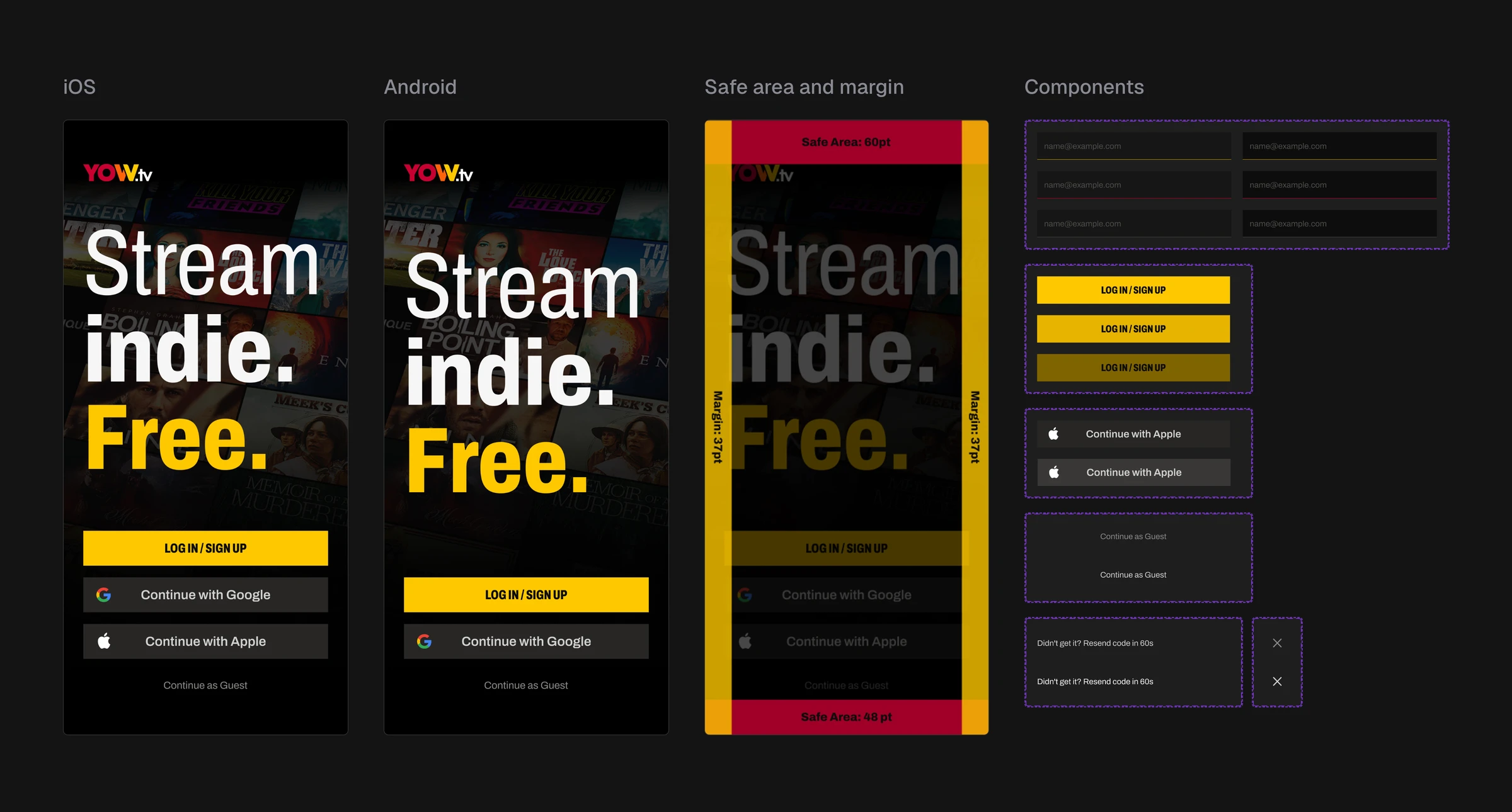
Two panels, Components and Overall. Left: the flow's controls inside dashed boundaries — the primary button in three yellows, a Continue with Apple pair, the guest link, six input fields, the resend line and the close control. Right: one splash overlaid with bands reading Safe Area 60pt, Margin 37pt and Safe Area 48pt.

The components and the margin overlay as they sit in the handed-over file: each control drawn again in the state it takes under a finger, and one screen carrying safe areas and side margins as measured bands rather than as a note. A specification a developer reads instead of asking about.


The Type and Radius Grid: Deciding a Look Nobody Had Defined


The brand had a typeface, a yellow and a wordmark, no interface. Nothing in it said what a corner should do, because nothing in the product had been designed. The radius was not a decision to overturn; it was one nobody had made. I built one grid: five typefaces across, four corner treatments down, the same call to action in every cell — square against a small radius, a larger one and a full pill.


Greg, the branding director, argued for the small radius. That is the correct default, and almost every streaming app on our benchmark board does it. I put the benchmark next to the grid and asked a different question rather than a contrary one: if everyone has a radius and our whole positioning is being the new one, what does none look like? We looked at it together, agreed on none, and shipped that way. Greg made the final call on the typeface. The square corner is the decision I have carried since: on a dark ground it reads as film rather than software, and nothing else there did that. It is also the one I have paid for longest — with no radius and no shadow, a card has very little left to say what kind of thing it is.

A grid of twenty yellow call-to-action buttons, five typefaces across and four corner treatments down — square, four-pixel, eight-pixel and fully rounded — each with the guest link set beneath it.

Five typefaces across, four corner treatments down: the call to action at its actual radius in every face — square, small, larger, pill. The corner is tested rather than argued, so the comparison a stakeholder makes is between pictures, not opinions.


Impact


The flow is live on the App Store. It is an address, a six-digit code and a date of birth, with a guest route that skips all three and a returning person routed straight past the last of them — and it is built on square corners, on the typeface Greg picked, and on six components documented down to their pressed states. Contus built it from the handoff, and I walked them through that document on a call before they started. The one thing I can say about the specification with any confidence is that it was complete enough to be built from, which is a low bar and the only one a first handoff should be judged against.

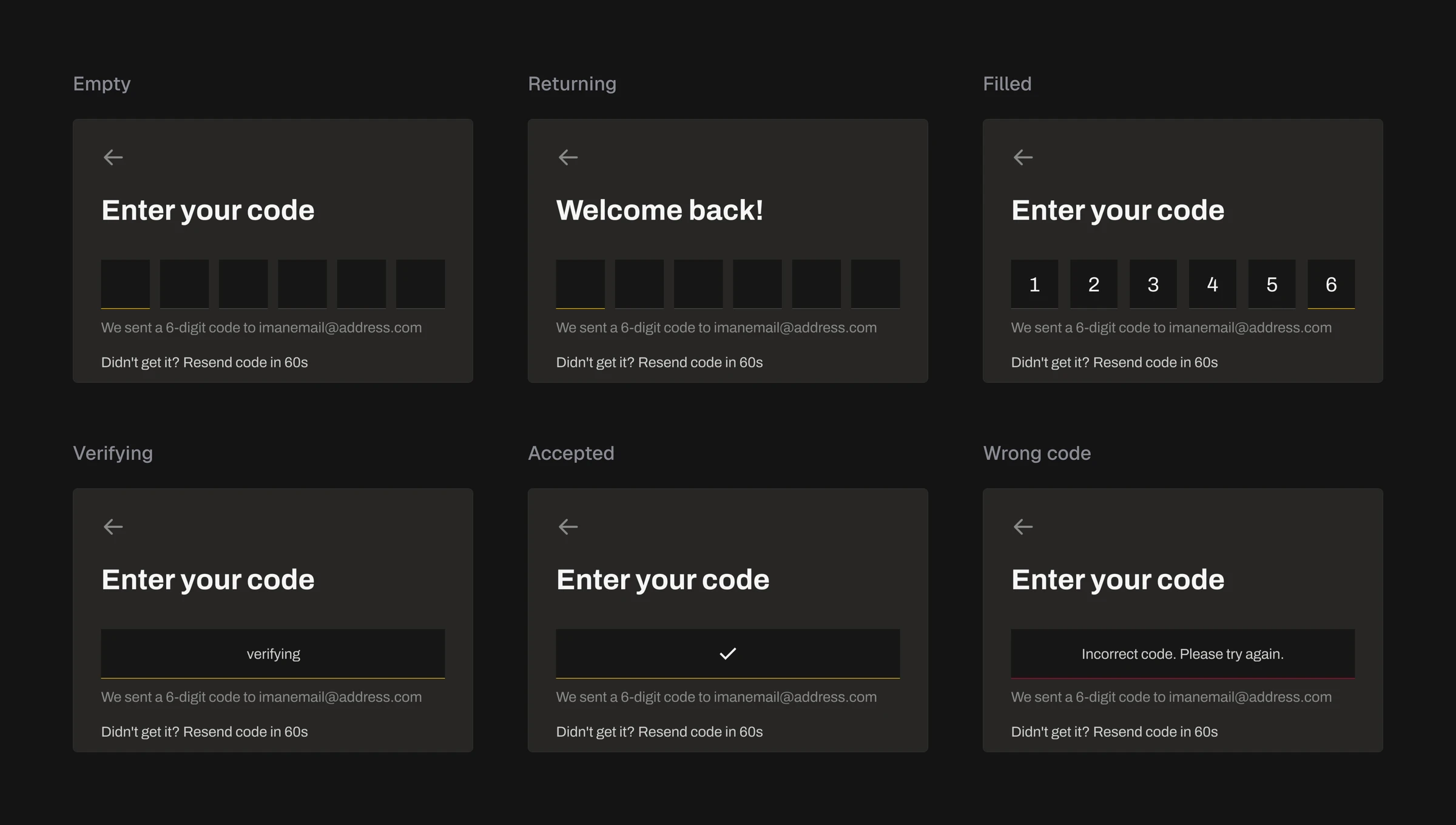
The same block of the YOW.tv code screen in six states, cut at one identical window: empty, returning, filled, verifying, accepted and wrong code. The heading, sent-to line and resend line hold the same position in every one.

The code screen in six of its states, cut at one window so the comparison is exact: empty, returning, filled, verifying, accepted, wrong. Nothing moves between them. The message for a wrong code occupies the field rather than appearing under it, so the helper line survives the error instead of being replaced by it.


I argued the name field away, and drew it anyway


The last thing I wanted in that flow was a name field, and the argument is one I would make again: every field between a person and what they came for is a place to lose them, a name authenticates nobody, and a profile screen is where a name belongs — later, when somebody has a reason to care what it says. I put it to Jack, my manager.


He said no, and the reason had nothing to do with any of that. Everybody in the system already had a name. The product was running with users in it, and the record they sit in carries one; a sign-up that does not produce a name produces a different kind of row. My reasoning was about a flow. The answer came from a table. It was correct and beside the point, and it is the first time I understood the difference between designing a product and designing for one that already exists.


What survived was not the argument. While Jack was explaining why the field had to stay, I asked what name meant here — the account's, the one other people see, or the one that has to be unique. Nobody had one answer, and the product's own profile screen carries a single field called Name beside a switch to a public profile. That question is where the account and profile architecture I wrote later starts, and it mattered once there was a social roadmap and a new development partner.


It did not help here. The screens I drew after that conversation ask What's your name? on one and What should we call you? on the next; the helper under the field promises only you can see it; one of its four errors says the name is already taken. I never settled which of those it was. I still think the argument was right, and they are good screens — they specify a field nobody had defined. The handoff I wrote for that page names four screens and calls them frozen and ready to build. The name step is not one of them. I drew it after the first handoff, when I had already told a development team the page was finished.

Credit


Founder and my boss — Joey and Brian, who sent the brief, and the permission to start over


Branding — Greg — the brand the flow is drawn from, and the final call on the typeface


Manager — Jack — the name conversation


Development — Contus — the development team at the time, who built the flow from the handoff