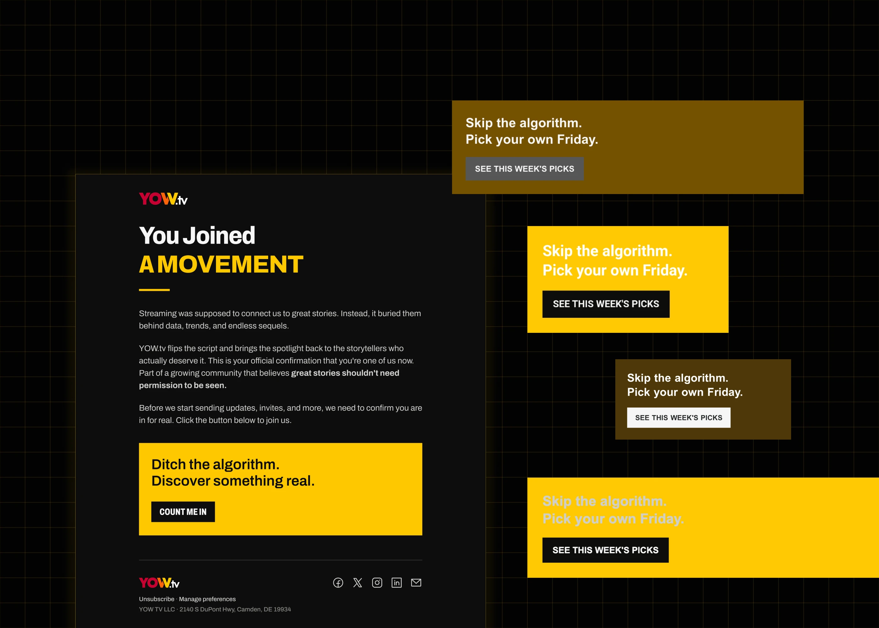
YOW.tv Email

Designing the one surface I don't control.

Company

YOW.tv

My Role

Product Design Intern — first designer hired

Tools

Figma · Claude Design · Claude Code · HTML/CSS · HubSpot

Timeline

Jul – Aug 2026

Description

YOW.tv is an indie-film streaming platform. Its lifecycle email went out on templates nobody had designed, into inboxes that rewrite what you send them.

Context

My manager asked me for email banners. The one we chose floated on the dark page like a sticker, and instead of redrawing it I asked how our emails looked at all — a question three levels above the banner. I rebuilt the set on flat images, because an image is the only thing every mail client renders as drawn, then built the production workflow around it, because an image was also the one thing nobody but me could edit. Four of the seven platform templates are deployed and sending; three have reached real recipients, thirteen sends between them.

I was asked for banners; the banner was the smallest thing wrong

This project was mine end to end: the rendering research, the tests, every template, the HTML, and the workflow the team runs it on. The brand the templates are built from is the branding lead's, Greg's. My manager, Jack, granted the project and runs the sends.

The banner failed, and the failure was three levels up


I had just finished the Campus Premiere page when my manager asked for email banners, so I drew a run of forty-eight with Claude Design and we picked one: a black bar with a yellow panel on the right, black type set into the yellow. Dropped into a template it stopped reading as a banner and started reading as a sticker left on a dark page. I had never designed for email, and there had never been a UX or UI designer on the team, so before redrawing anything I asked a more useful question — what do our emails look like now? Jack set me up in HubSpot and I read the live set. Everything centred, none of it following the brand book, images at whatever resolution they arrived in, copy nobody had edited.


That is an aesthetic complaint, and aesthetic complaints do not get budget. What made it a project was an inference the medium happens to allow: email rendering is deterministic per client. Gmail on Android does the same thing to the same markup for everyone who has it. So a message that looks broken to me and to my manager is not broken for two people. It is broken for everyone on that client, and the company has around fifty thousand monthly active users. A sample of two is a small sample of people and a complete sample of renderers. I put it to Jack in roughly those terms and he told me to go and fix it.

Eight rows of six email banners on one dark board, every one the same wide short shape, running from type-only settings through solid yellow fields, orange and magenta gradients, film-strip perforations and photographic strips; one banner carries an outline.

Forty-eight banners on one board, six to a row, all at the same wide, short proportion: the variable is the field — flat, gradient, film strip or photograph — and how much of it the brand colour takes. The one we chose is mostly black — logo and CAMPUS PREMIERE in white — with a yellow panel across the right third carrying two lines of black type. That panel is the black-on-yellow pairing the probe later measured at 12.51:1 as designed, and it is the part of the banner the inbox damages.


Plot Twist 1: I built the fix the whole field recommends, and it changed nothing


Dark mode was the first thing I checked, because YOW is a dark-first brand and half of what we send is near-black with yellow on it. There is a standard answer to that in every email-development guide — a prefers-color-scheme block, plus the two proprietary attribute hooks Outlook exposes — so I built the same email twice: variant A with none of it, variant B with all of it. I expected B to hold. I sent both to real accounts on real devices and had them opened and shot in six clients, light and dark, twenty-two captures per variant.


Variant B rendered the same as variant A everywhere. The only pixels that differed between the two were the ones in the line naming which variant it was. So I stopped trying to control the rendering and measured what the rendering was doing instead: the strip I had designed at 12.51:1 contrast comes back as white-on-yellow at 1.55:1 in Gmail on Android and pale-grey-on-yellow at 1.13:1 in Yahoo. Six rules came out of the captures and every one of them is design-side, because there is no lever on the other side to pull.

Two variants of the same email opened side by side in Gmail on Android and in Yahoo on the web, each pair labelled with the contrast the strip actually renders at, above a difference map of the two Yahoo captures in which one small bright mark near the bottom stands out of an otherwise black field.

The same strip from both variants in two clients, each with its measured contrast printed beside it. Below, two captures differenced: the body cancels to black end to end and one small bright mark survives near the bottom, on the line naming which variant you are looking at.


Plot Twist 2: I had ruled for live text, and then chose the thing nobody can edit


My first written decision was that type should stay live text. It is the right instinct almost everywhere: live text reflows, it translates, it can be selected, and anyone can change it. Then two measurements landed on top of each other. The first is that web fonts do not load in Gmail or Yahoo, so of every hundred people who open a YOW email, two or three see the brand typeface and the rest see Arial. The second is from the probe: opaque image pixels were the only element that came through all four renderings untouched.


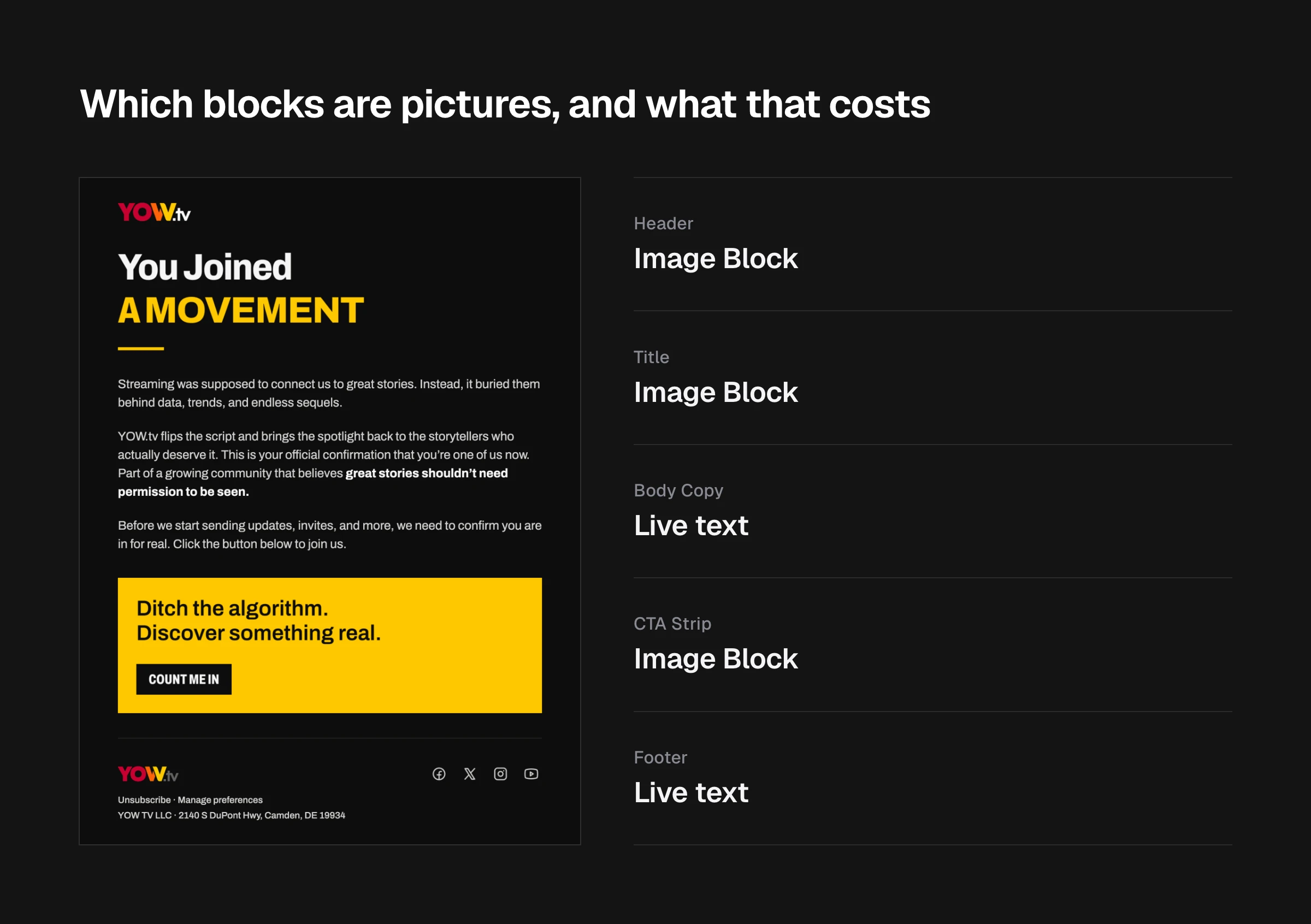
So I reversed my own rule. The brand moments — the masthead band, the headline, the call-to-action slab — are baked into flat images and everything else stays live. In the client that inverts hardest you get a white page with black body copy punctuated by dark, on-brand blocks, which reads as a layout rather than an accident, and the headline is set in the real typeface for everyone rather than for the two or three. What it costs is written in my own constraints document, in a table of costs, in four words: copy changes need a designer. At that point the only designer was me.

The YOW.tv welcome email rendered from its built HTML, with connector bars marking each region as a baked image or as live text, and the cost of each choice noted beside it.

The welcome template as built, with every region marked image or live, and the price of each mark beside it. The blocks that hold their design in a client you do not control are exactly the blocks nobody can retype: consistency and editability are one axis read from opposite ends. The finished template, opened in Yahoo on the web and captured in light mode and in dark, comes back identical: across 6.4 million pixels of message body, not one differs.


The Outcome: seven templates, a module, three pages, and a document


What the team has is seven templates in the platform, a custom content module their own staff fill in, three preference-centre pages, and a document that tells whoever makes the next image exactly how to make it. The rest of this page is those.

Four YOW.tv email templates rendered side by side at one scale from their built HTML: a welcome, a submission receipt, a ticket closure and a Campus Premiere invitation. All four share the header-band construction; the first two carry a yellow call-to-action slab and the last two do not.

Four of the seven platform templates, rendered from the built HTML. One masthead is shared by nearly every template, with a single Campus Premiere variant; each then gets a header band in the same construction but its own words. The ones that ask for a click also get a slab built the same way — the ticket closure and the invitation ask for nothing and carry none. The errands have almost nothing in common as messages, and the construction is the same three parts every time.


Template Family: One Look, Seven Different Errands


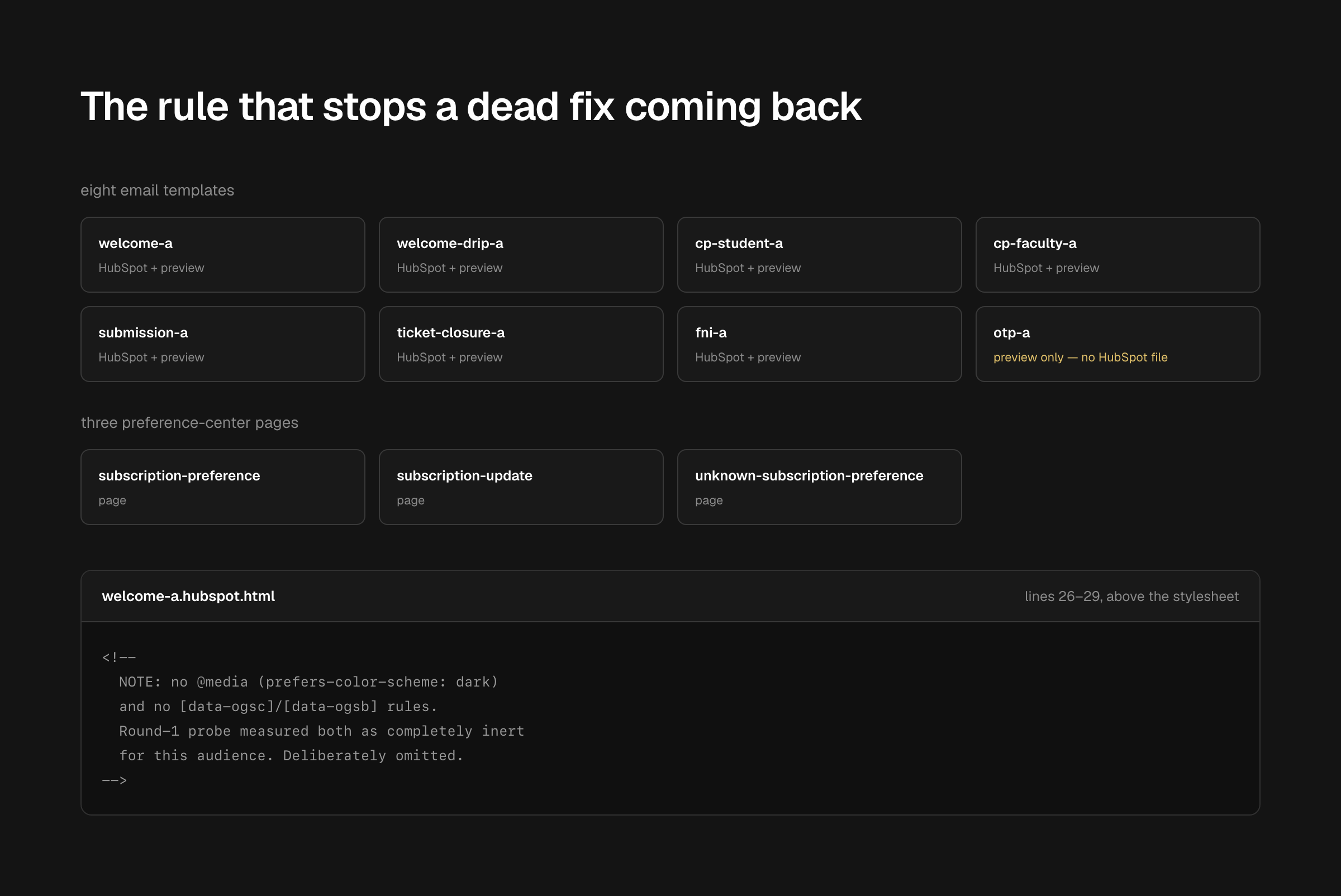
A welcome, a drip, a submission receipt, a support-ticket closure, two Campus Premiere invitations and a weekly picks edition have almost nothing in common as messages. What holds them together is three parts. One masthead banner is shared by nearly every template, with a single Campus Premiere variant beside it. Each template then gets a header band in the same construction but its own words, and a call-to-action slab built the same way as the header band. Every export exists twice, desktop and mobile, re-typeset rather than scaled, because scaling a 552-pixel slab down to phone width renders its button label smaller than the body copy underneath it. The probe's finding went into the source rather than into a document, as a comment above the stylesheet of every template saying that both dark-mode hooks were measured inert and left out on purpose.

Eight email templates and three preference-centre pages listed by name and file format, one of them marked preview only, beside a source comment quoted from above a stylesheet and three notes recording what the build turned up.

All eleven artifacts named individually — including the one flagged as preview-only rather than folded into the total — beside the comment as it sits in the source. A finding in a document gets re-argued; one above the stylesheet is read by whoever is about to undo it.


Weekly Picks: Editable Content Inside a Locked Layout


The weekly picks edition used to be made by cloning last week's email and editing it, which is how a template drifts. It is the only template in the set with content that changes every time, so it is the only one built as a custom module: two featured picks fixed at two, and a grid of four to eight, defaulting to six. Staff get a plain form per pick — poster, title, tag, description, link — and no way to move anything, which was the point of choosing bounded repeater groups over the platform's freeform drag-and-drop area. The watch button sits inside repeating live content, and a yellow fill with dark text is the exact pattern the probe forbids — so I first rebuilt it as yellow type in a yellow outline on a dark fill, and flagged it for sign-off because it visibly differs from the mock. What shipped bakes it instead: an image is immune to the clients that lighten text, and the button is the one thing in the module that never changes, so nothing is lost by fixing it.

The HubSpot editor form for one weekly pick, showing the Title, Description and Watch link fields with their help text, beside the dark row it renders with poster, tag, title, description and a watch button.

The editor form for one pick beside the row it renders, at the same scale. Every field a staff member can reach is a value; every decision about where it sits was made once — two featured picks fixed at two, a grid of four to eight. Three of the pick's five fields are in frame, with the title and description filled and the watch link still blank: the weekly edition has not had its first week.


Preference Pages: Holding the Brand on the Way Out


I found these by accident, clicking through my own test send. The unsubscribe and preference-centre pages were in the same state the emails had been in, and they are the last thing a leaving reader sees. I rebuilt all three in the email set's language — preferences, the update confirmation, and the fallback page for a contact the system cannot identify. They never went through Figma; I wrote them as HTML directly, which took an afternoon, and it is the right route for a page whose entire layout is platform-generated markup you do not control. Reading that markup turned up something better than a restyle: the previous template was hiding the platform's own unsubscribe-reason survey behind a display rule and showing a decorative one that stored nothing.

The three YOW.tv preference-centre pages side by side on a dark ground, each carrying the same masthead, type and ground as the emails, with the platform's own form output held inside that frame.

Three pages whose middle is platform output, not mine to lay out, so the design lives in the frame around it: the same masthead, the same type, the same dark ground as the emails. Rendered from the local previews, whose forms approximate the platform's own markup.


Image Blocks and Live Text: Where Editing Stops


Six rules came out of the captures and they are all prohibitions, because that is what a medium you cannot control gives you. Never dark text on a light fill, since anything dark-on-light collapses in the clients that lighten text and leave backgrounds alone. Never near-white artwork on transparency, because a transparent region shows the inverted page through it and a white mark stops existing — the footer wordmark's .tv had to be re-toned to a mid grey that reads on white and on near-black alike. Never let a hairline or a fill alone carry structure, because one client flattens three dark tones into one and takes the rules with them. Keep #0d0d0c rather than pure black and #f6f6f6 rather than pure white, because inversion algorithms target the pure values hardest. Design at Arial metrics and expect a tenth more width. And treat every block as all image or all live, never half, because a yellow slab with a live button inside it inverts in two directions at once and looks broken in a way neither pure option does.


The part that is built for somebody else is the export contract. Each image block is one frame, named for the file it produces, so the name is the same word in the design, in the folder and in the markup. Desktop and mobile sit in matching folders with identical filenames, so the only difference in the code is one path segment. And every image block keeps a live-text master beside it, because once a headline is a picture its type specification exists only inside the picture, where nobody can read it or reset it.

The same yellow email block shown three times across the top — as designed at 12.51 to 1, then as Gmail on Android and Yahoo on the web actually render it, at 1.55 to 1 and 1.13 to 1 — with the six prohibitions and the export contract set out beneath.

The six rules, and the export contract that makes them enforceable. One block, one send, three openings: 12.51:1 as designed, then 1.55:1 and 1.13:1 as two clients actually render it. They lighten the dark text and leave the fill where it was, so the yellow survives and the words walk off it.


Impact


Four of the eleven are deployed in HubSpot and sending, and three of those have gone to real recipients, thirteen sends between them. The set replaced templates that followed no brand book with one masthead, one header construction and one slab construction, checked against a measured model of four renderings rather than against one dark Figma frame. The weekly edition no longer has to be cloned to be made. The dead dark-mode fix is written into the source of every template as a comment saying it was measured and omitted, so the next person to reach for it reads the result first. And a test send caught twenty links rendering empty in the weekly module — every one of the per-pick URLs, while the plain fields in the same rows carried real content. That one was not mine: the platform's own URL field type is unreliable nested inside a repeating group on this account. I swapped both fields to plain text and wrote the warning that the old values do not survive the change and every link has to be re-entered.
The succession is the part that has not shipped


The whole design is a debt repayment. Choosing pictures over live text bought consistency and charged editability, and I am the one who made that choice, so the workflow around it is mine to build: images produced from named frames in a program the branding lead already uses, dropped into matching folders, swapped into the platform by my manager without anyone opening Figma. I am the one doing it now; the point of building it this way is that the email system does not collapse the moment I leave.


The four templates that are live are the four that need none of it. They are fixed-content lifecycle mail — a welcome sequence, two invitations, a ticket closure — written once and sent as they are. The one template built for other people to run is the weekly picks edition, with the module, the bounded repeaters, the form per pick — still the best thing in the set, and the only piece of it that would let somebody make a YOW email without me. The last open question in my own handoff document asks who sources the poster art each week and at what point in the week they do it, and I did not answer it. The weekly edition has not had its first week. The handover itself is half demonstrated: the branding lead has produced an image from the named frames, which is the step the workflow was built to make routine. Whether my manager has swapped one into the platform without me, I do not know.

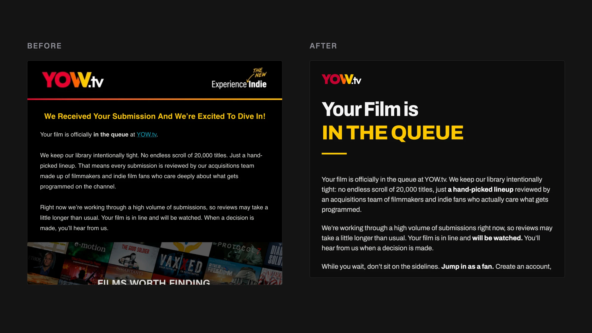
Two YOW.tv submission-receipt emails side by side at one scale: on the left the template that was replaced, a centred title-case headline over a stock collage; on the right the same message rebuilt on one masthead and one header band.

The same errand, before and after. Left, the submission receipt the set replaced: a centred title-case headline over a stock collage. Right, the same message and much of the same copy on one masthead and one header band. Both are the top of the email; both run on past the crop.


Credit


Manager — Jack. Granted the project, and runs the sends.

Branding — Greg. The brand the templates are drawn from, and the imagery the workflow hands over to.