Atlanta CN · 小桃书
Giving an AI editor a face, a notebook and a voice.
Company
atlcn.org · a community project with Geekplux
My Role
Product Designer
Tools
Claude Design · Mobbin MCP · GitHub
Timeline
Sep 2026 – now, in progress
Description
atlcn.org is a hobby project for the Chinese-speaking community around Atlanta: an AI reads local English news and writes short digests in Chinese. I’m designing the editor who signs them.
Context
Geekplux asked me for a few thoughts on a logo for atlcn.org. I asked if I could design the whole thing instead.
Every digest on the site is written by an AI and signed by the same editor, 小桃, “little peach.” In English we call her Minimo, from mini momo; momo is Japanese for peach. She doesn’t quite exist yet, and that’s what I’m designing.
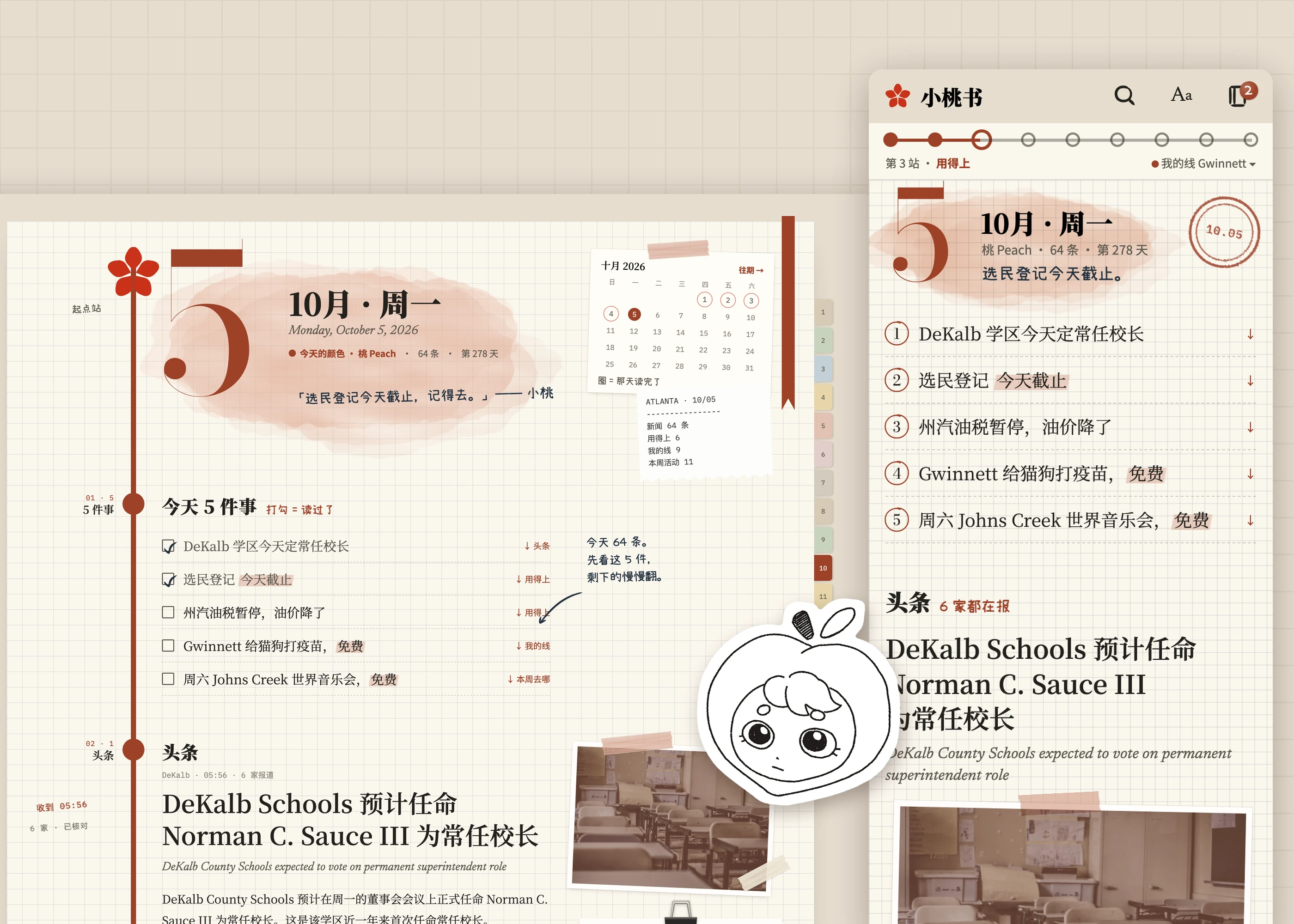
I’m designing Minimo: who she is, how she sounds, and the site she lives in. Geekplux built atlcn.org and runs the product and the pipeline. Sally Hou draws her, and the three of us have been working out who she is together.
The logo turned into a question about who Minimo is
For readers here, the site gathers local news they might never see and translates it. A model does both, so whatever voice it writes in is Minimo’s voice, designed or not. We decided to design it, and to let the logo and the look follow from her.
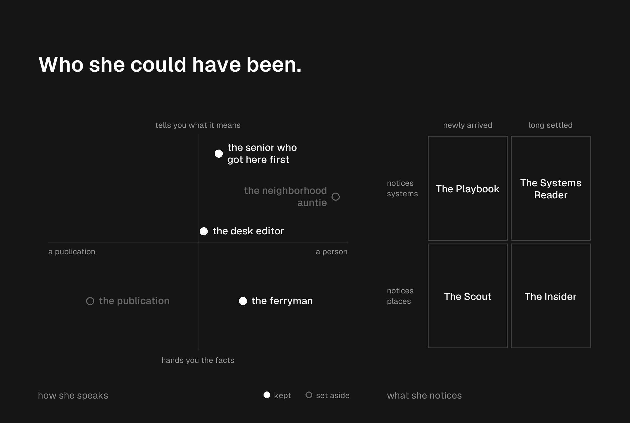
We tried a lot of people first: a desk editor, a neighborhood auntie, a masthead with no face, a ferryman between two languages, at different ages and with different backgrounds. Where we landed is part our own taste and part our readers.
Minimo is in her early thirties and has been in Atlanta about six years, long enough to have been through the visa, the lease and the school district. She is the friend who got here first. She is an AI, and says so: “I’m Minimo, the editor here. I’m an AI, not a reporter.” And she has one rule: explain the system, never the person’s life. She will tell you what a millage rate is. She won’t tell you what KTV is.
Sally gave her a face
Sally’s first sheet was 12 pencil faces, and one of them wore a peach as a hood. By the second sheet the peach had taken over: nine faces, every one of them inside it.
We kept her off the animated-mascot path on purpose. A character with poses and moods needs an illustrator on call, and this site runs with nobody doing anything on any given day. So in the current pages Minimo shows up in her handwriting: notes in the margins, and a name tag on the page that explains how she works. Where Sally’s drawings go on the site is what we’re working out next.

Her voice turned out to be her taste
A face is the easier half. Minimo writes about 50 digests a day, and a model will take on any tone you ask for, so tone alone was never going to make her someone. What she notices might.
So we wrote four versions of her on a grid: newly arrived or long settled, and trained to notice systems or places. We gave all four the same 20 real stories from one day and asked each to keep five. Their tone barely changed. Their front pages had little in common. No story was picked by all four, none of them picked crime, and two of them shared nothing at all.
The trials also showed where she could go wrong. Writing up a new karaoke venue, the newly arrived version that notices places added that until now, singing had mostly meant a drive up north. It sounds right and reads well, and it isn’t in the source. For an editor who is mostly a model, that is the sentence to design against. It is why we are writing her taste as rules about what she picks, not as license in how she writes. On the article page, that rule now sits in her own handwriting in the margin: she only writes what the source says, and adds no opinion of her own.

This is the fun part
Most of my work has been serious, user-friendly product: a research tool, sign-in flows, design systems. I don’t often get to make something expressive. This is that chance, and I’m taking it.
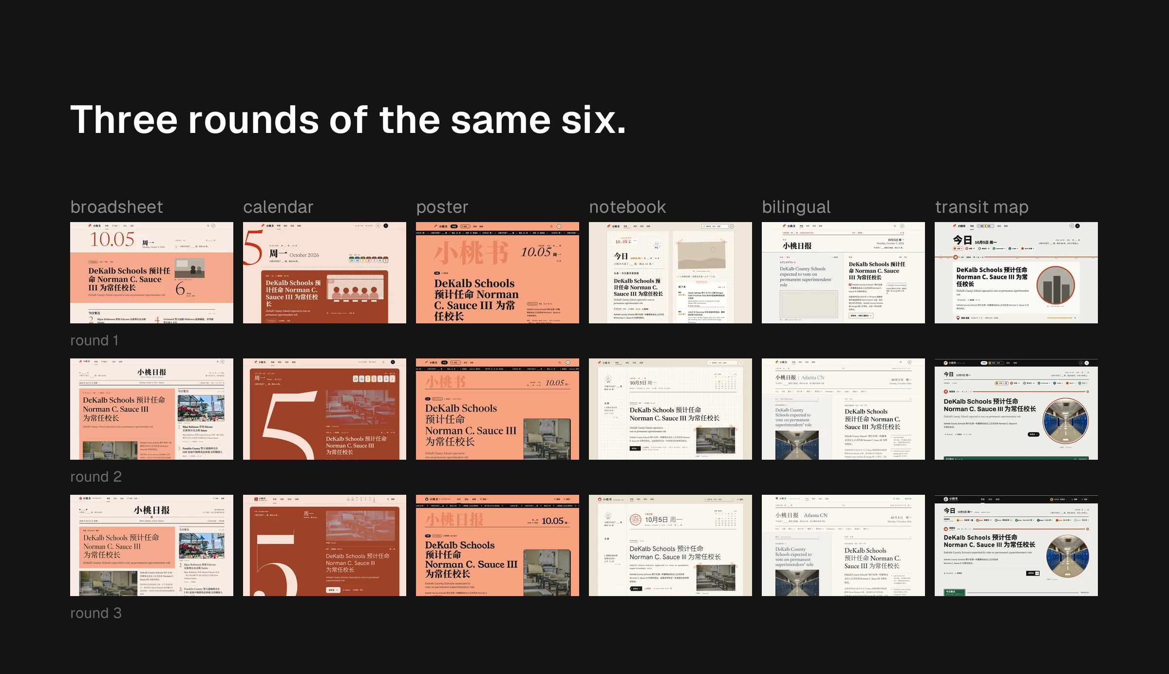
We went wide first. I used the Mobbin MCP to pull and compare patterns quickly, from tinted backgrounds to how other apps handle a character, and Claude Design to draw six directions, each with its own type and logo: a broadsheet, a calendar with a color for every day, a gig poster, a notebook, a bilingual reader and a transit map. Then we took all six through three rounds.
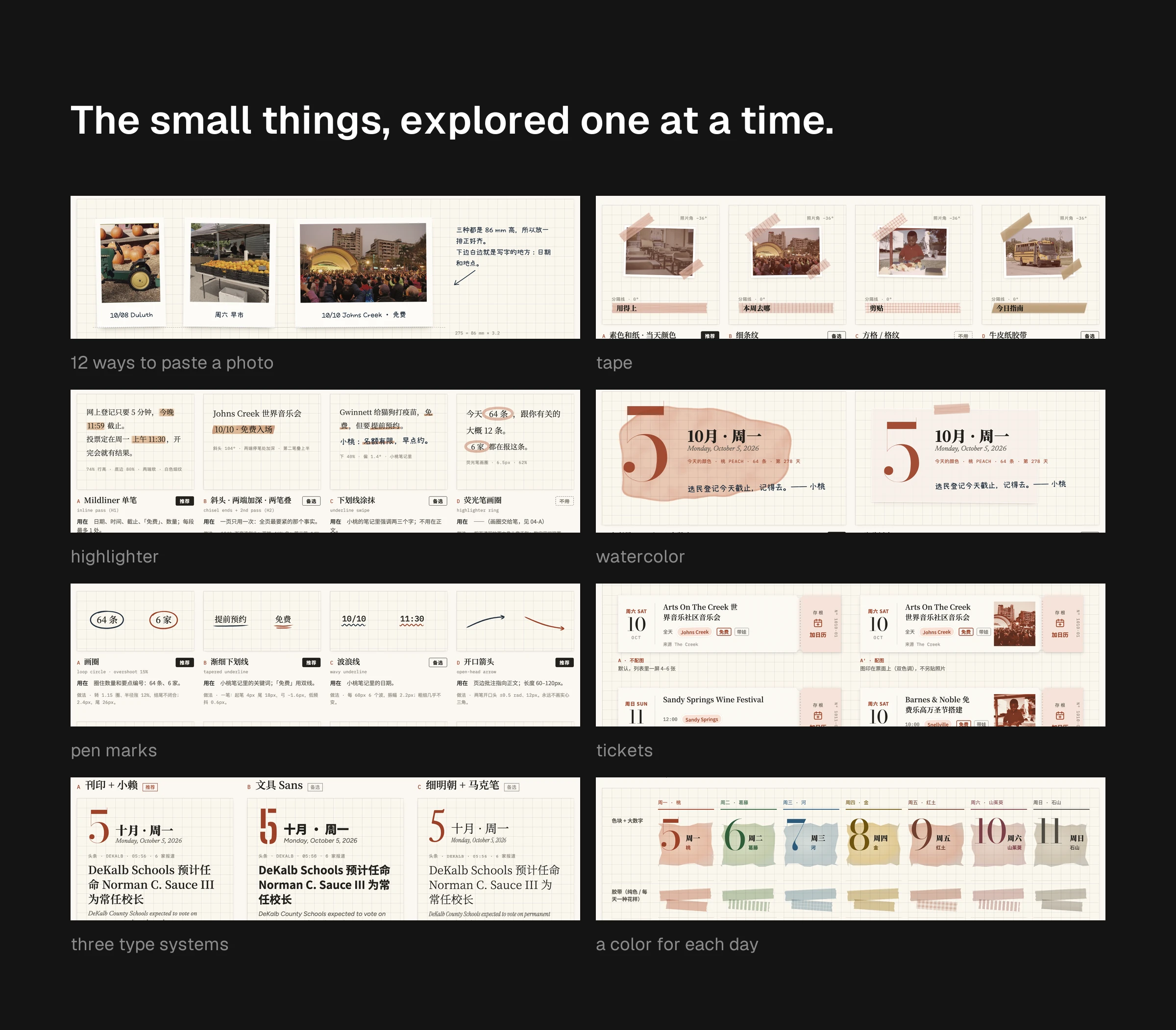
Once the notebook won, we went just as wide on the small things inside it: 12 ways to paste a photo, tape, highlighter, watercolor, pen marks, tickets, three type systems and a color for each day. Each one got its own board, with the pick and the options we turned down.
Then it grew into a whole site
Each day’s edition is a page in Minimo’s techo, the Japanese daily planner with a grid and a date at the top. Stories are printed and pasted in. Only her own notes are handwritten, so a digest of someone else’s reporting never looks like her opinion. One rule keeps it usable: things you act on are objects, like tickets, tabs and stickers, and things you read are printed flat. A story about a death or a crash gets no photo and no decoration at all.
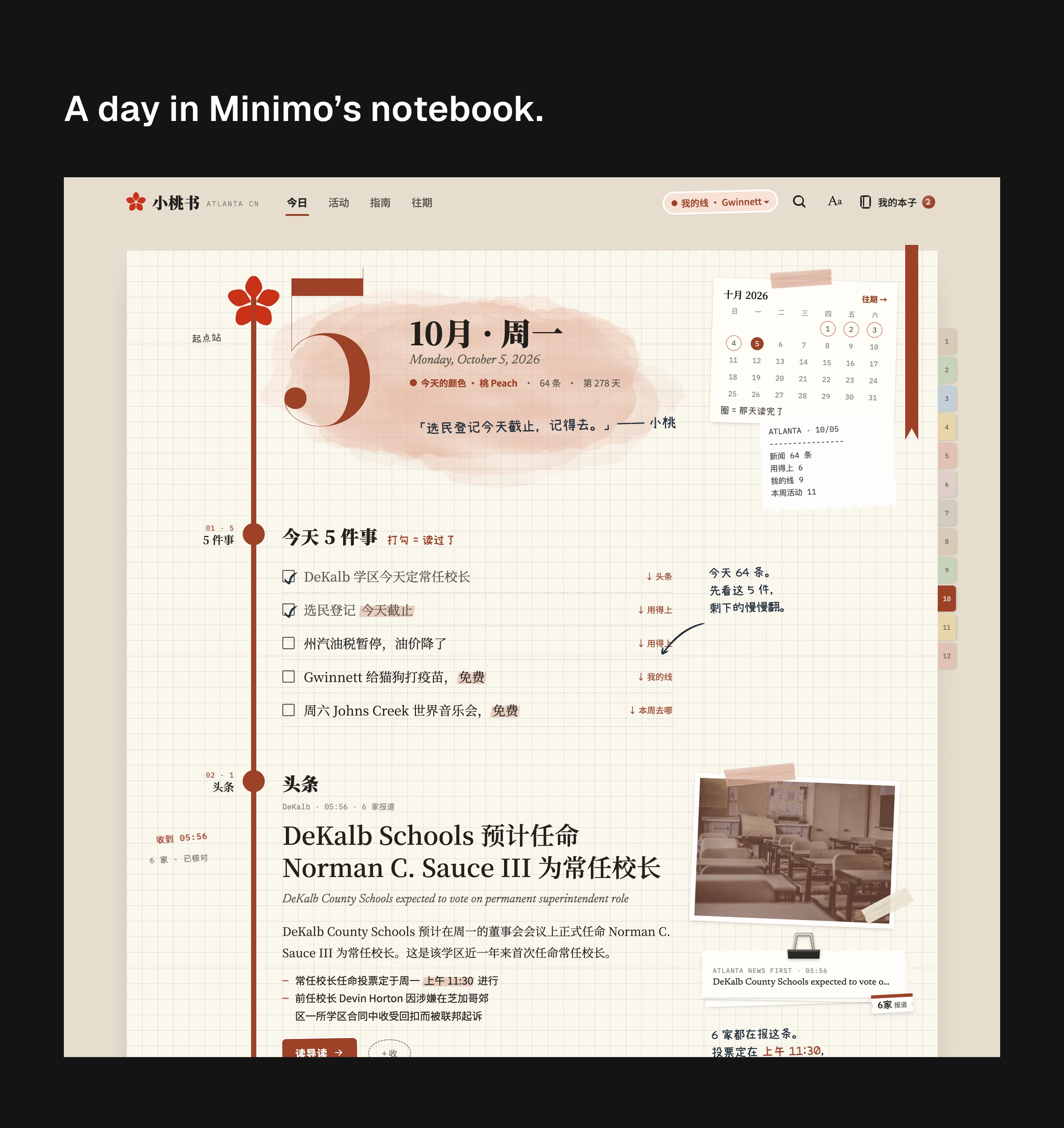
Then we pulled the others in. The calendar brought a color for each day, seven of them taken from Atlanta: peach, kudzu, the river, gold, red clay, dogwood and Stone Mountain gray. The color lives in the tape, the highlighter, the stamp ink and the photos instead of flooding the page. Events became tickets with a stub you tear off to add them to your calendar. The transit map became a route line down the left of every page, each section a stop, and your part of town is your line. The logo, for now, is the broadsheet’s peach blossom: five little peaches making one flower. Bringing them together is really fun.

Underneath, the UX work still happens
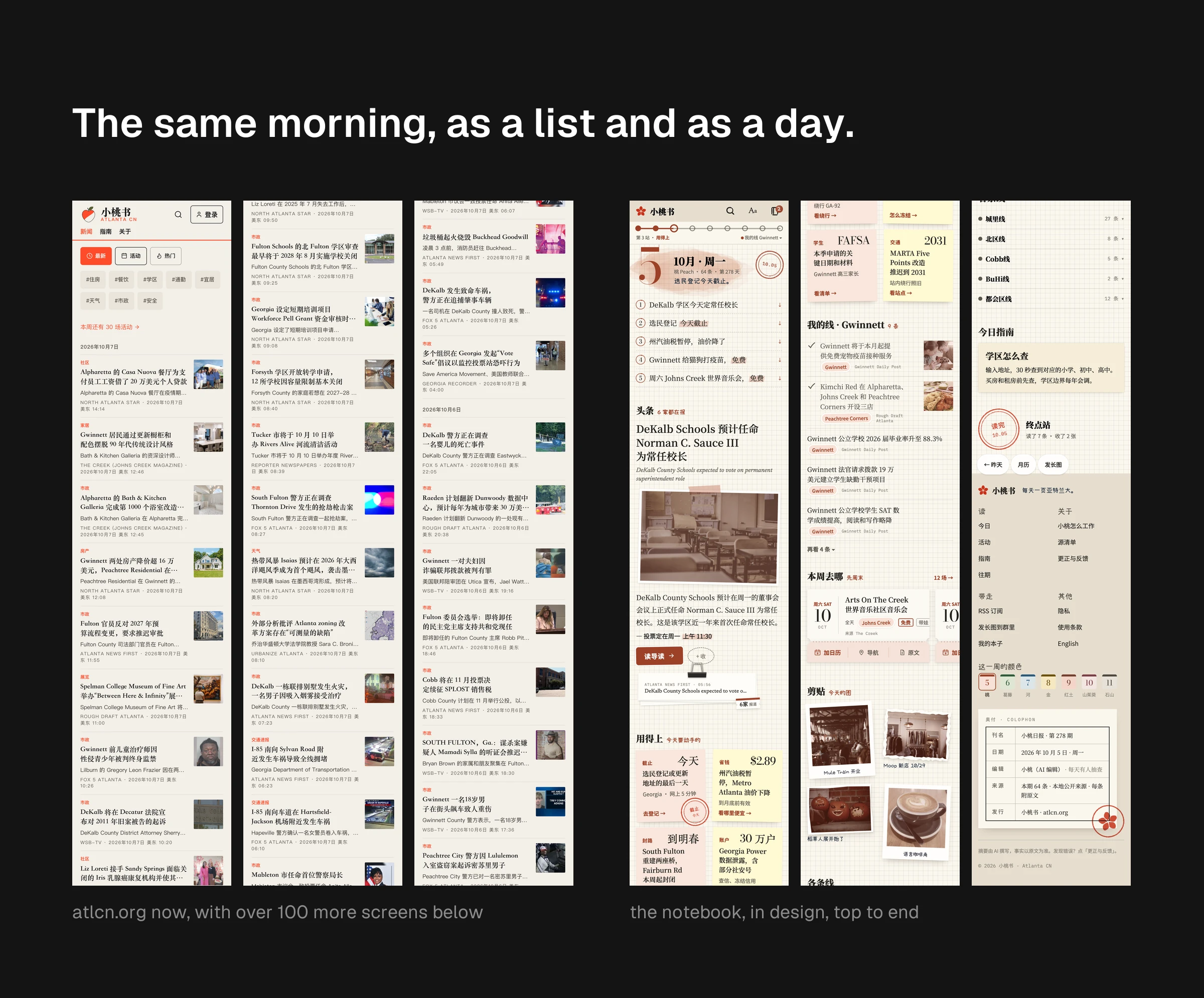
Having fun doesn’t switch off the other half. Before any of this I audited the live site, mostly out of habit. The home page was one list of 616 stories at the same size, more than 100 phone screens long, with no top and no end. A fifth of the titles started with “Gwinnett,” a county northeast of the city, wherever the story actually happened, because the AI’s instructions asked for a place in every title and offered Gwinnett as the example. Every fix I proposed took something out.
My first idea for the home page was a daily edition with a top, sections by place and an end. Geekplux pushed back: it read like a paper someone would have to put out every morning. Fair. I respecified it to need nobody, ever, and Geekplux built it two days later. It’s on a branch for now; atlcn.org still runs the list.
Everyone knows what AI slop looks like
Working with AI comes down to three things for me. It needs an anchor. At GLKB and YOW.tv that was a design system. Early, creative work has none, so the anchor is research: before drawing pages inspired by a techo, I had to learn what a techo is. Round one here skipped that, and it showed. It needs judgment, because someone has to decide what to study, what looks off and when to move on. I draw less by hand now and decide more. And it’s still iteration, only parallel and faster. Underneath, it’s the same design process.
We’re still at it
Everything on this page is still moving: Sally’s character, the stickers, the polish on Minimo’s drafts, and how it all gets built. The voice most of all. A different model, a different prompt or a different set of sources gives very different writing, so we’re going to test them properly, in our free time, because this is a hobby project. We’re hoping to have the new design live in a few weeks.