The rules I kept repeating to every agent, refined together into a system they can apply, and checks that hold them to it.
Role
Design and code, with Claude
When
Oct 2026 – now
Where it stands
Ongoing, v0.2
Two faces, named roles, the parts built from them, and one gray in 16 steps.
5media that read one token file
16steps of one cool metal, Rhodium
1,212 → 6contrast failures on ten case pages
On this page ›
Repeating rules
Every agent heard the same notes, so I wrote them once
Five of the notes, and the rules they became.
By November I had agents on the site, the deck, the résumé and two products of mine, each getting the same notes from me: group this, draw the graph, the gray is too faint. So the notes became one file every session reads first.
Rules are defaults, not laws: “It depends on the context and the content.” Only what can be measured is a hard floor: contrast, the 4 px grid, clearance and padding.
1
8 Oct · The type, locked. Eleven faces on the same deck slide, then pairs, then full sets: Schibsted Grotesk for everything, Instrument Serif for the voice.
2
22 Oct · The shape of a page. Show, then say: every beat opens on a figure, the words caption it, and depth folds. “If they choose to not see it, fine.”
3
6–7 Nov · The color, overnight. Five directions on the live pages, then metals, then one strength, compared on lossless renders with a difference blend and a color picker.
4
7 Nov · The foundations in a day. Space, radius, text styles, figures, motion and content, each shown on real pages before and after, each decided by me: version 0.2.
5
7 Nov · Applied, five at once. The site, the deck, the résumé, joIndex and joSite, in five sessions, each reviewed by the session that worked the system out with me.
How pieces fit
No magic: everything comes from somewhere
The principle is from industrial design: a false physical system. Everything on the page comes from somewhere and goes somewhere, so every page is a bento and pages are places: a case opens out of its card.
Where each page lives, and how long each move takes; back is shorter than the way in.
Most changes are cuts. Motion is spent where continuity is the message, or on a named delight like Contact.
Schibsted carries everything; the serif is used only for the punch.
Schibsted Grotesk is the boat: plain enough to hold any project, with good numbers. Instrument Serif is the voice, one phrase a block, because serif for all large type “doesn’t quite hold all of the different projects.”
1
The template’s faces. DM Sans and Inter on the site, Geist in the figures and the résumé: “neither quite made the cut.”
2
Eleven sans, side by side. One deck slide with real numbers, set in each. Only Schibsted and Inter Tight had tabular figures and a slashed zero.
3
Serif, sans, or a mix. All serif didn’t hold the projects and read worse; a quiet serif lost the reason for one. “So what do we do? A mix. Serif only used for contrast, for the punch.”
4
Measured afterwards. Seventeen faces, read from their font files: Instrument Serif is the narrowest, so a phrase changes width and shape at once, and it needs only 3% more size to share the sans’s x-height.
5
My name stays in the sans. On the deck’s cover and close since 8 October, and everywhere since.
1
Pages are places. Home is the center; the catalog and cases below, About above, time to at the side, prototypes in their own tab. Close goes up a level.
2
Short, on one curve. Page moves 320 in and 240 back, down from 700; the first screen 600, its tiles 40 ms apart; one curve for everything that travels.
3
Laws that bend, on purpose. Contact and About’s little cases are named delights. “It’s about context and balancing.”
4
Hover is tone, not movement. A card steps up one surface; nothing lifts or zooms.
A host for guests
The host stays neutral so the guests keep their color
GLKB’s blue, KICK’s lime, YOW’s yellow: my system has to house other systems, “which becomes the fun part.” So the ground stays near neutral, and a guest’s color lives only in its dot, its voice line and its own figures.
On screen each guest keeps its own lightness; on paper all five are deepened to 3:1.
The cool comes from my industrial design desk: cool-gray markers are how a product sketch renders metal. Color words didn’t survive a fact check (gunmetal is a bronze), so the rule became: name it after a metal that has the cast.
Where the cool came from: metal in cool-gray marker, at Avient and on TC-01.Rhodium, picked within the metal: a thin cool finish over a neutral base.
1
It started as a template. The site’s grays came with its Framer template, neutral from #090909 to white. The type had changed in October; the color hadn’t.
2
Five directions, on the live pages. Today cooled, Graphite, Bead-blast, Ice and Blued steel. Graphite, Ice and Blued steel went out on one rule: black stays black, white stays white. Bead-blast was still too blue, and petrol was “def not petrol.”
3
One hue. Between steel at 240 and blue at 255, it landed at 247 in OKLCH. Two more candidates merged: at this strength nobody could tell them apart.
4
Metals, by their real cast. Gunmetal is a bronze, titanium read warm, aluminium was too common, Osmium too blue. Rhodium and Chrome are both platings: a cool finish over a neutral base.
5
Picked within the metal. Chrome’s contrast felt better to me, so its darks were tested at Chrome strength. I couldn’t tell them apart, so the simpler rule won: Rhodium, one strength all the way down.
6
Checked like a sample. The first renders were JPEG, and they had erased the tint. Every comparison after that was lossless.
7
Muted, more muted. “As it says, it’s muted.” It moved to the AA floor, 4.5:1, and the ramp gained a step, 450, to hold it.
8
Detail reads at its size, or it goes. On paper I tried a ring around each guest’s dot, five ways. “These rings … are not going to read at that size.” They went; guests are deepened instead.
9
The grain is anodization. “The grain need to be there or it will look flat.” A fine white noise over the dark surfaces at 3%, named surface.anodize; none on light or paper, where it wouldn’t show. Under it, muted on a card read 4.48:1, so Rhodium 450 lifted a hair to hold the floor. Decided; it lands in the next version.
Written for agents
Rules an agent can apply, and checks that hold it
Raw values, the roles that point at them, and five media that read only the roles.
An agent can’t apply taste, but it can apply a role. Every value is a token in two layers: raw values, and roles that point at them; each medium reads only the roles.
The audit set the first jobs. Before aligning anything, I ran a heuristic evaluation of my own site with Claude: 20 findings on 24 pages. The top one, a gray at 3.2:1 on every page, set the muted token.
One command checks a page against the floors; on ten case pages, contrast failures went from 1,212 to 6.
One command checks every page before I publish. It flags; it doesn’t decide: contrast, clearance and padding block, and the rest is fixed or explained.
1
I decide; agents propose. A change arrives with its reason, shown on the real work before and after, and lands only when I say so. Every rule says whose it is: mine, agreed by me, or proposed by Claude.
2
Departures are said. A session that bends a default writes why: joIndex runs at app density, the deck keeps its near-edge bento.
3
Versions. Major for a principle, the color or a face; minor for a new token or rule; patch for a tuned value. Every change goes in the changelog.
4
Sessions review sessions. Each of the five that applied the system was reviewed by the one that worked it out with me, before I looked.
5
The checks get checked. Applying it showed where they over-count: a hidden page read as hundreds of clearance hits, every screen caption flagged. Those fixes go back into the system.
6
This page is part of the system. “Every time we update the system we need to update the case study.” A change isn’t done until this page shows it.
Five media, one token file
The same place in each medium, before and after.
The same tokens now run five media: this site, my interview deck, the résumé, joIndex and joSite. Paper has its own rules: the white is the paper, sizes are whole points, and the résumé still fits one page.
Components, built once on the tokens; 9 more are named and not built yet.
Components came last, from real use: 21 built once, proposed as v0.1, and 9 more named; none applied back to the media yet. The deck alone builds a phone seven times, which is the case for building them once.
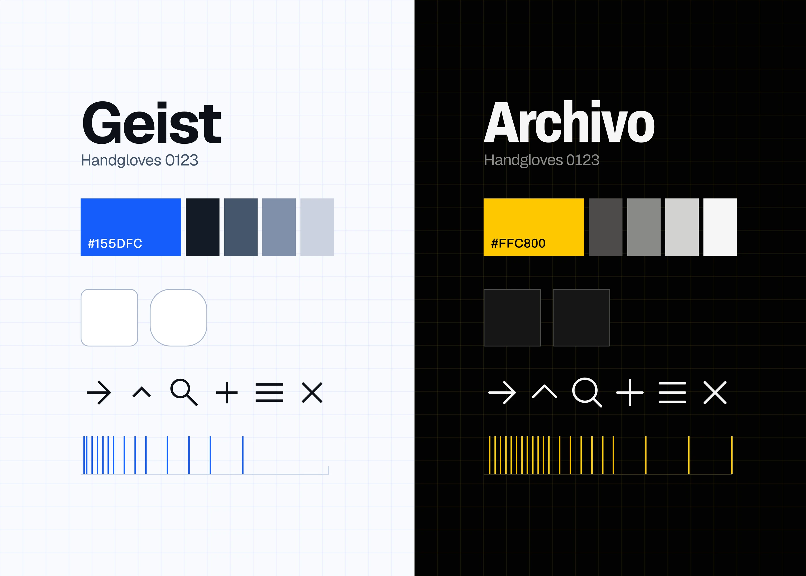 The two systems I built before this one