KICK.
I designed the ranking system, then cut it.
Company
U.S. Soccer × GT MS-HCI
My Role
Lead Product Designer
Tools
Figma
Timeline
Aug – Dec 2025
Description
Pickup soccer runs on group chats, manual RSVPs and waitlists in someone’s Notes app. Kick. moves the organizing power back to the players.
Context
I built a competitive ranking system into a pickup-soccer app for U.S. Soccer, to get people showing up, then cut it: my own evaluation found that verifying scores and assigning referees is operational work inside a product built to remove it. That one Severity 4 usability flag became the feature the product is for; four expert evaluators scored what remained 83.75 on the System Usability Scale. U.S. Soccer did not plan to build KICK., but took it as inspiration for their mission of growing the grassroots game.
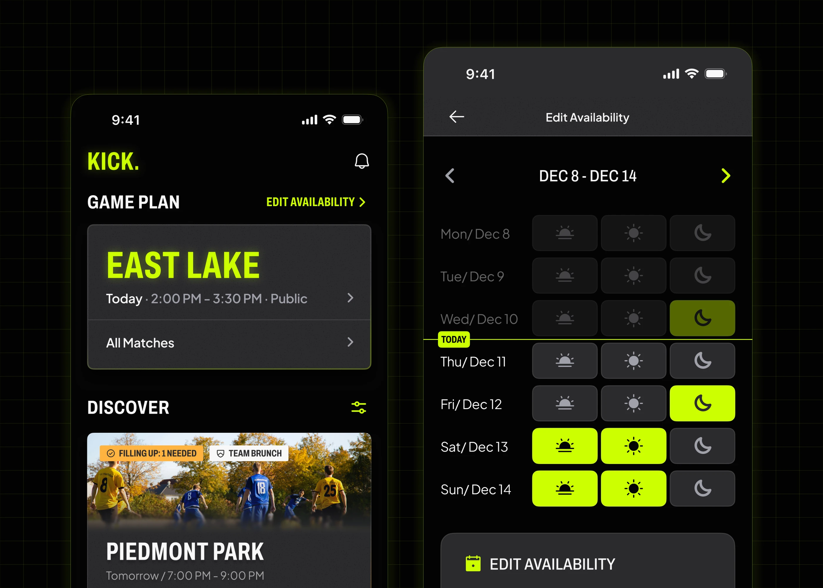
I drove the product concept, the screens and the prototyping, on a design system I built from Figma variables and text styles. The primary research, ideation and user testing were a team effort. I was the only member with design experience, so every mid- and high-fidelity screen and the interactive prototype came through my hands.
Pickup soccer’s freedom is paid for in admin
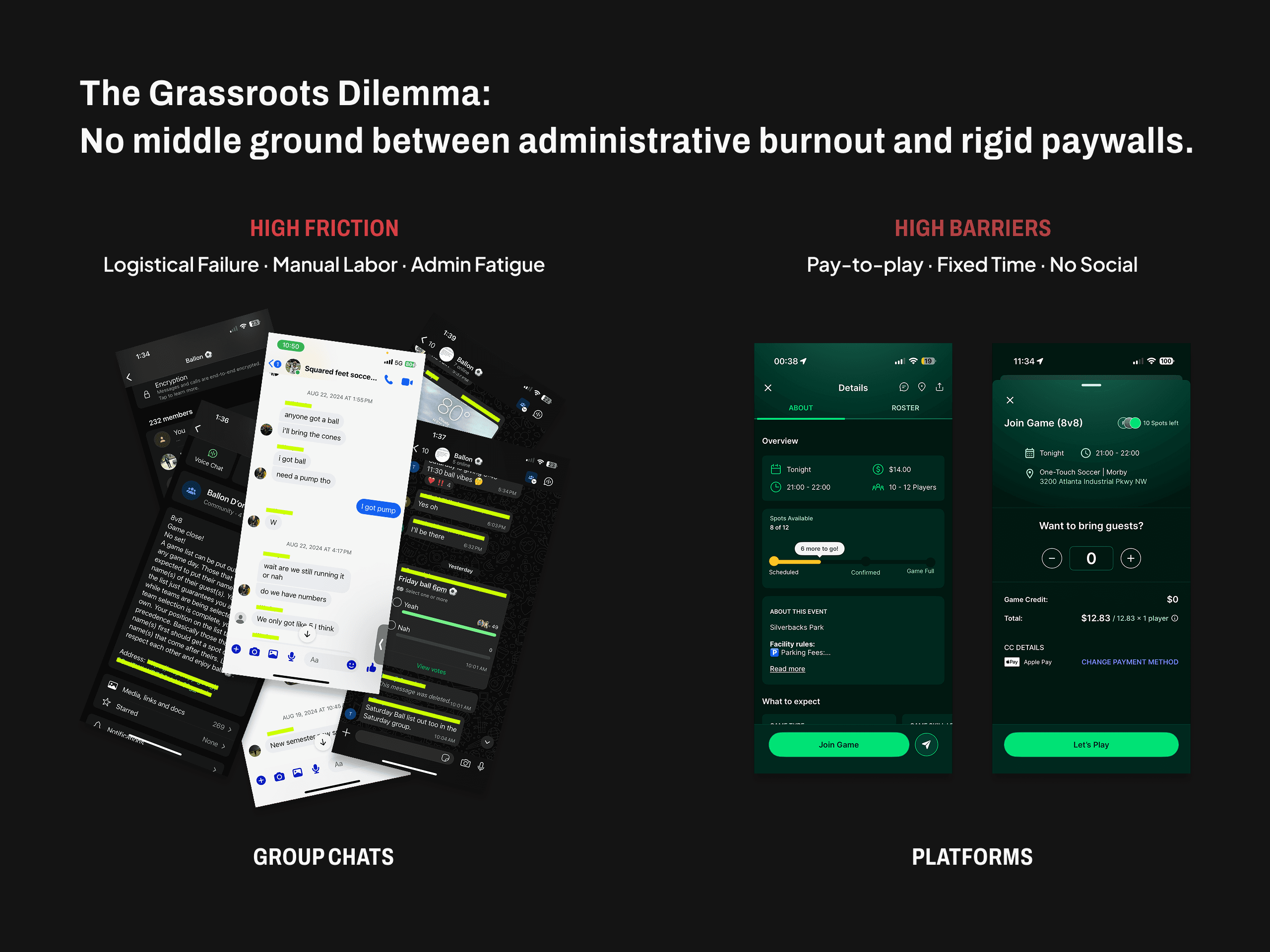
Players organize their own games and pay for that freedom in coordination overhead: chasing RSVPs by hand, keeping waitlists in a notes app, re-answering the same logistics every week. One interviewee put it plainly: “Some don’t show up and other brings a bunch extra guest… it’s a mess.”
The established apps solve it from the other end: they sell a seat in a game the company scheduled. The friction surfaced on an affinity map built from 17 interviews, four field observations and an analysis of four products. I wrote much of the interview guide, ran five of those conversations, and did the benchmarking.
I built the competition in, and then I cut it out
The competitive structure was mine. I designed score reporting and referee assignment into the first build, on the assumption that a league structure is what turns a pickup game into a habit. The achievement layer beside them was a teammate’s.
Before the next client sync, the internal critique turned up something uncomfortable: verifying a score and assigning a referee is operational work, and removing operational work was the product’s entire premise. When we showed the concept to users and to U.S. Soccer’s stakeholders, the people who had praised the competitive structure in earlier rounds now listed referees and score reporting as friction. The two findings corroborated each other. A player put it cleanly: “Having a referee … means the game is serious, but really all I care is if my buddy’s playing or not.”
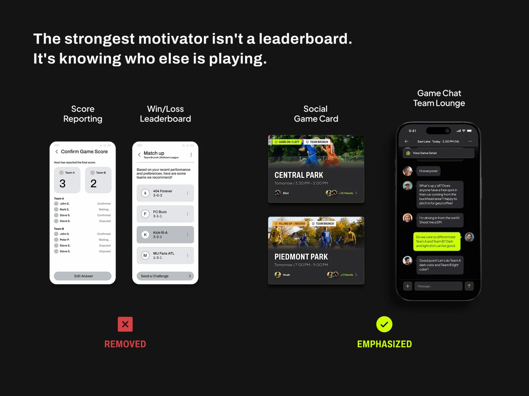
So I cut my own feature. Score reporting came out, ranking was rebuilt on participation, and the social layer went into every surface, all to get players connected and on the grass.
The one Severity 4 became the thing the product is for
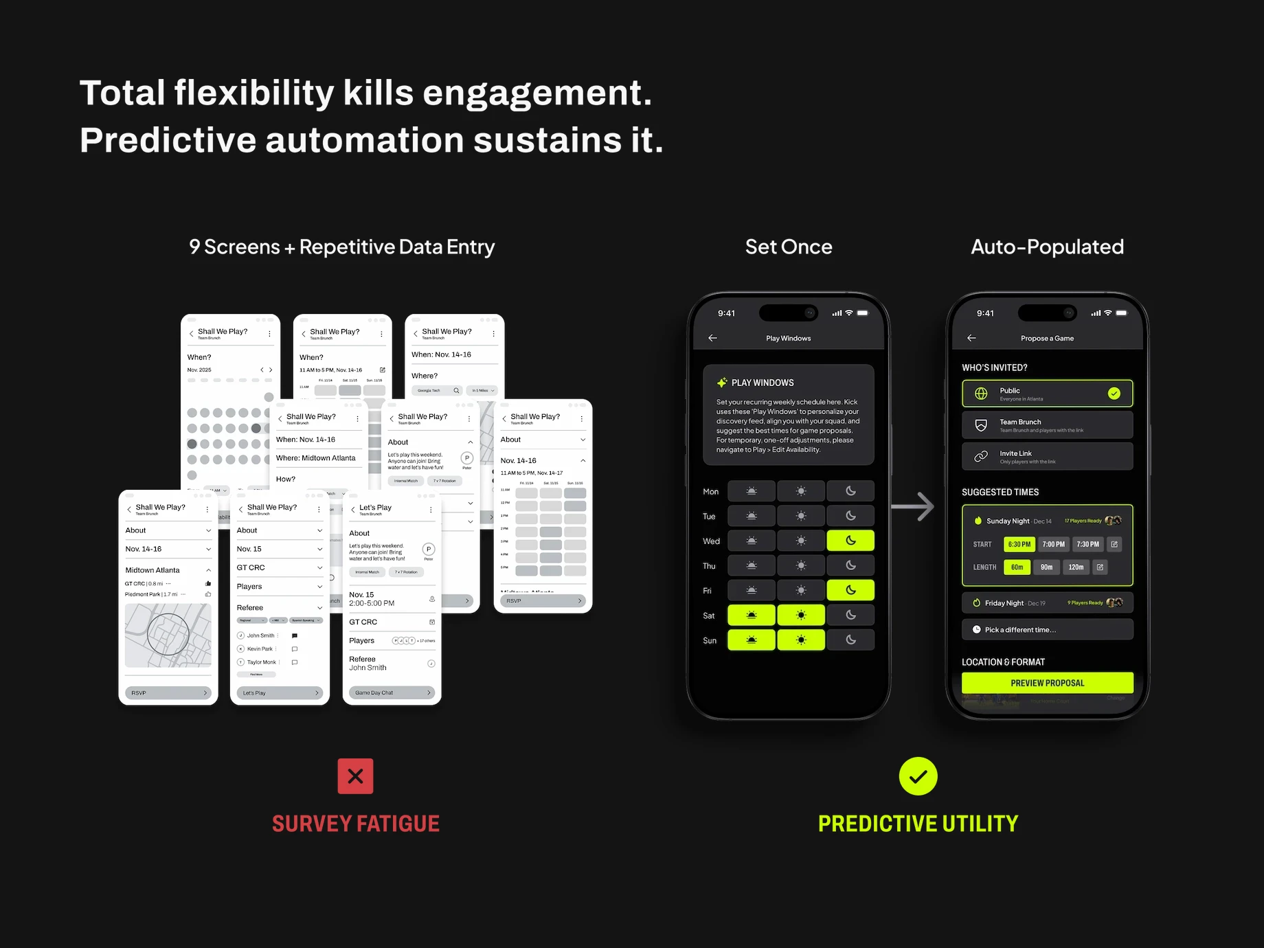
The operational cost was still there, so I ran Nielsen’s 10 heuristics against the prototype to find out where. One Severity 4 issue outlived everything else: scheduling a single game took rounds of syncing across several screens. We had taken what was already happening in the group chat and turned it into features and steps. The recommendation became Play Windows: recurring availability declared once, which the app overlays across a squad to suggest a kickoff time. The proposal flow goes from nine screens to two.
The heuristic evaluation and the think-aloud sessions converged on one verdict about our own work: “we must reconsider an IA and flow of the entire platform.” The sidebar came out, and the three-tier profile carrying player tier and referee level flattened into four tabs with the player at the center: Play · Squad · Rankings · Profile.
The Outcome: Declare Once, and the Game Finds You
What U.S. Soccer received was a concept, a prototype and an indexed handoff packet. The rest of this page comes from the working file rather than that packet, so some of the frames below carry work I added alone later.

Dashboard: Balancing Orientation and Opportunity
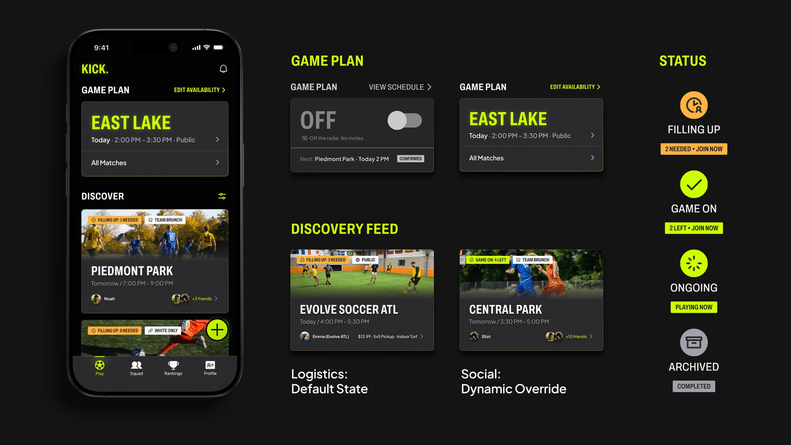
Players open the app with two questions: where do I need to be, and where can I play. The landing screen answers both without a tap. The Game Plan widget anchors the top with the next game; below it the discovery cards carry the few facts that decide attendance: time, cost, format, who else is in. A player can qualify a game without opening it.
Scheduling Loop: Automating Routine and Exceptions
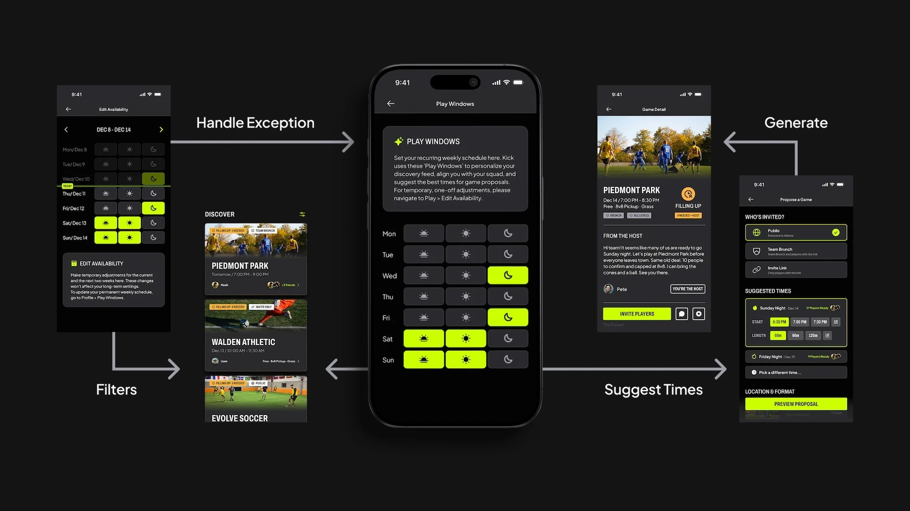
Manual scheduling treats every week as a blank slate. I split it in two: routine is declared once in Play Windows, exceptions in Edit Availability, which states its own scope in its own copy: “Make temporary adjustments for the current and the next two weeks here. These changes won’t affect your long-term settings.” The recurring baseline is the system’s single input: it filters the discovery feed and drives the suggested times inside a proposal.
Social Engine: Connection and Consistency
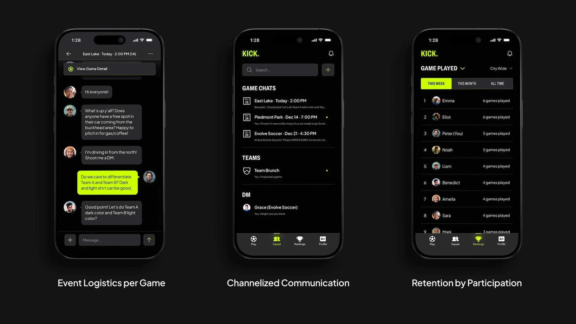
The same split shapes the Squad tab. A game’s own chat sits apart from the list that keeps each game’s thread separate, and both sit apart from the team lounges. The ranking that replaced the leaderboard counts games played rather than games won.
Design System: Street Energy and Usability
U.S. Soccer shared its own design system with us: red, white and blue, shouting AMERICA. After talking it through with their design team we moved away from it, for two reasons. American soccer is not one audience: the fan base is a patchwork of sub-communities, many formed around a country of origin, and a national-team palette speaks to one of them past the rest. And pickup is spontaneous and social: this is not a product for supporting a national team, it is a product for getting a game to happen tonight.
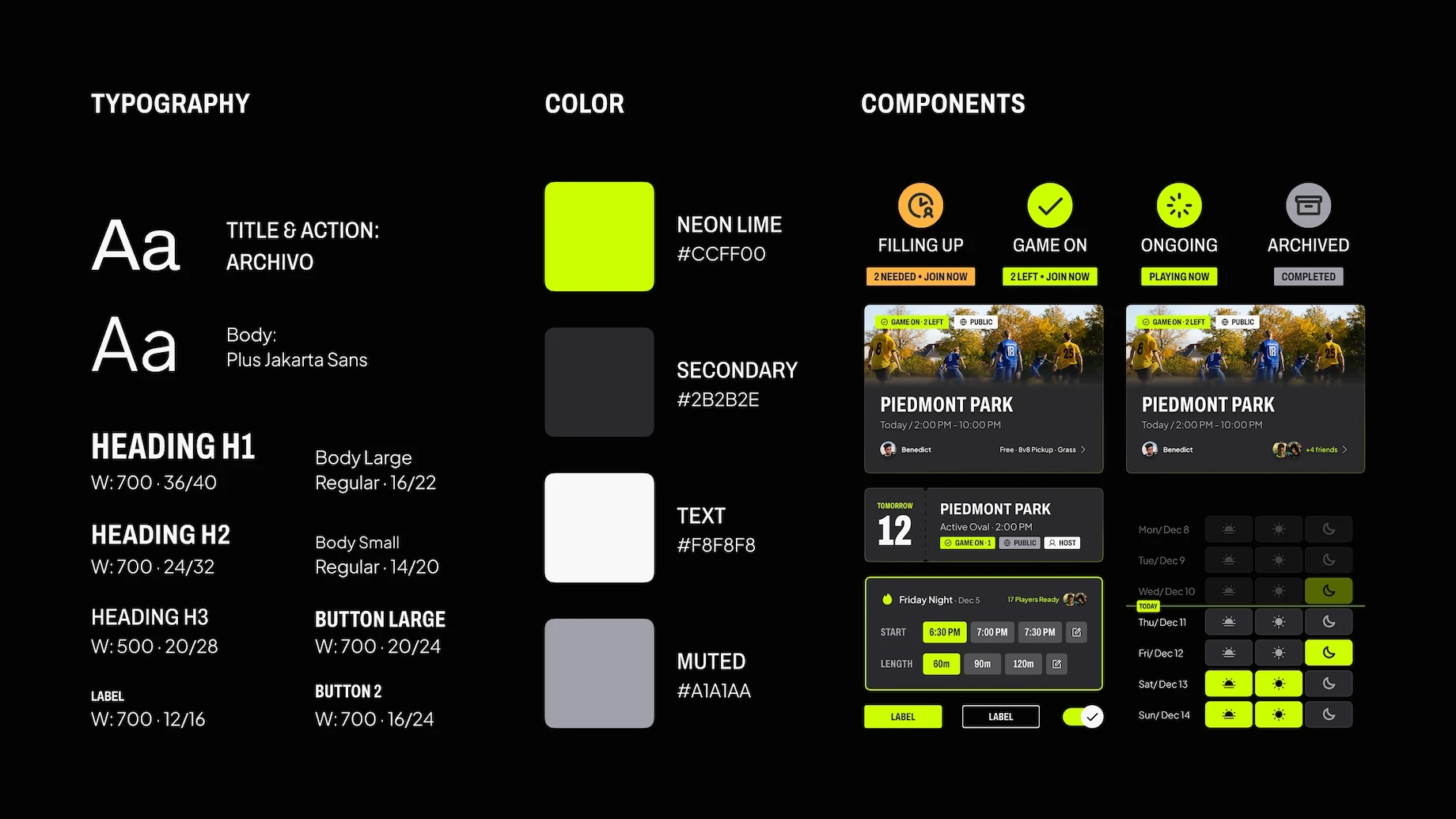
So KICK. went dark to hold the street feel, Archivo in all caps against neon lime carrying every interaction cue, grounded by Plus Jakarta Sans and muted grays so the energy stays readable rather than loud. Lime was not the first accent. Orange was, and the client’s own question ended it: “does orange on black pass the contrast checker?” Four status treatments pair icon, word and badge, so a player can tell from any surface whether a game is filling up or under way.
The revision I made after everyone had left
The team’s final report closed with four Key Issues unresolved. After the course ended, I reopened the file alone and answered all four. One-off schedule changes, where the report concedes the design “forces them to wait until Monday”, got the Edit Availability screen. Confirmation was read as “I have joined”, so CONFIRMED became GAME ON. Game cards were indistinguishable, so dates went relative and game-type chips arrived. The proposal button was inconsistent, so PREVIEW PROPOSAL became a solid anchored action. All of it binds the variables the graded work used, and none of it is in the packet: the handoff predates it.

Impact
Four expert evaluators scored the prototype 83.75 on the System Usability Scale, individual scores between 80 and 87.5. Two of the four were U.S. Soccer staff, and I ran the Product Manager’s session myself; it returned the highest score of the four. A U.S. Soccer software engineer assessed feasibility in a single session: a Flutter front end, backend state for scheduling, and data sourcing named as the hard problem. Then the engagement closed.
The best thing I drew is not in the product
The prototype had an Active Toggle — one control for whether you were open to play. I liked it more than anything else small on the page: it made availability an event rather than a setting, and I built the motion, a circle rotating to reveal a check as the pill fills, like a ball rolling on grass. The team was delighted with it.
Then U.S. Soccer’s engineer said it confused him, and once I sat with that I could see he was right. Not about how it looked — I still think it is the best small piece of craft in the file — but about the logic underneath: nothing in the way anyone uses this app makes availability a thing you flip on and off. It came out in the solo revision. The motion exists in one Figma file and nowhere else.
Credit
Team — Riley Liu, Raj Sureka, Emily Jeong
External partner — U.S. Soccer (Marc Henry Ibeneme and RJ Sajjan)
Special thanks — Dr. Carrie Bruce and Dr. Lynn Dombrowski, our professors
Thank you also to everyone who took part in our research and evaluation sessions.