YOW.tv Web
The website of an indie streamer, where nobody knows the films.
- Role
- Product Design Intern, the first designer
- When
- May 2026 – now
- Where it stands
- Handed offHome, the film page, Browse, profiles and sign-in
- 5handoffs, August to October
- 390–1920pixels wide, phone to big screen
- 4shapes, one for each kind of thing
On this page
Nobody has heard of these films
Say you've got a free evening and you open YOW. It streams independent film: no stars, no franchise, and nothing on Home gave you a reason to pick one. Every poster had one shape and one size.
It's a cold start for the whole catalogue, like a new video with no views, but for every film. That came from my audit of every page and a benchmark of Netflix, Apple TV and YouTube, not from viewers, so it's the first thing I'd test. Every page has to give a reason to watch.
The app's way in, and the emailsA view I reversed
I argued for months for mixed poster sizes, so the eye knows where to go first. Others wanted every poster portrait, like a video store. I drew the range with Claude Design, from all one size to fully mixed.
Then the team took my proposal for a social layer: lists people make, people to follow, what friends share. With films, lists and people side by side, a size per item stops meaning anything. So I changed my mind. Now shape says what a thing is.

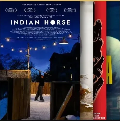

So a list or a person can be the reason to watch. The side that wanted portrait posters kept them, and now portrait means something.
Most of social waits for a later build. Nobody yet knew which social features people wanted, so research comes first, and an empty watch party is worse than none. I handed the social Home off as one frame marked Do not build, so it was designed and kept out of the build at once.
A reason first, then proof
Until there are people to meet, each film's page has to sell it alone. So it leads with a reason to care: the story behind the film, then its synopsis. A critic's review, the audience's rating and comments come second, because a new film has none yet. When they're empty, each space invites the first one.
I built it as a prototype in code, with Claude Code, on YOW's tokens, so the motion is real: Pause and Rewind slides in over the synopsis.
Lists by people, found by filters
But most nights you don't have a film in mind. That's Browse, and its reason to watch is people. Lists are open to anyone: YOW, partners or viewers. A list by YOW or a partner is a square, a list by a person shows their circle. The promise fits in one line: picked by people, not an algorithm.
It opens as shelves. Pick a filter and they become a grid, with the filter in the address, so a search can be shared. Type in search and three columns fill: the genre, its films and the lists.
The filters got simpler after a note from Greg, the brand director: too many controls on the surface. Type, genre and runtime stay on the bar and apply live. The rest wait in All filters.
A profile is where a person's lists live, so anyone can become a curator. It's private by default, and its handle is set once.
Forms are pop-ups, reading is a page
The pages around the films follow one rule: anything you fill in is a pop-up, anything you read is a page, so you never lose the film you were on. Contact, Advertise and a new watchlist open over what you were doing. Submit Your Project, help and the legal pages are pages. The cookie banner was redone because the old one had no way to say no.
Sign-in is the biggest pop-up. On the web it works by link, not by a code, and my mobile design follows the same rules. Afterwards you're back where you were, and the rating or save you asked for is done.
Five widths, the same rules
YOW is watched on phones, laptops and TVs, so Home, Browse and profiles were handed off from a 390 phone to a 1920 screen. A wider screen shows more posters, not bigger ones. Rows run off the edge on purpose so the next card shows, and below 744 forms and filters become full-screen sheets.
Designing in states, not platforms, is how I'm taking this to TV: a hover state on the web should be a focus state on a remote. That part isn't solved yet. Each handoff carries the same names I design with: tokens, states, breakpoints.
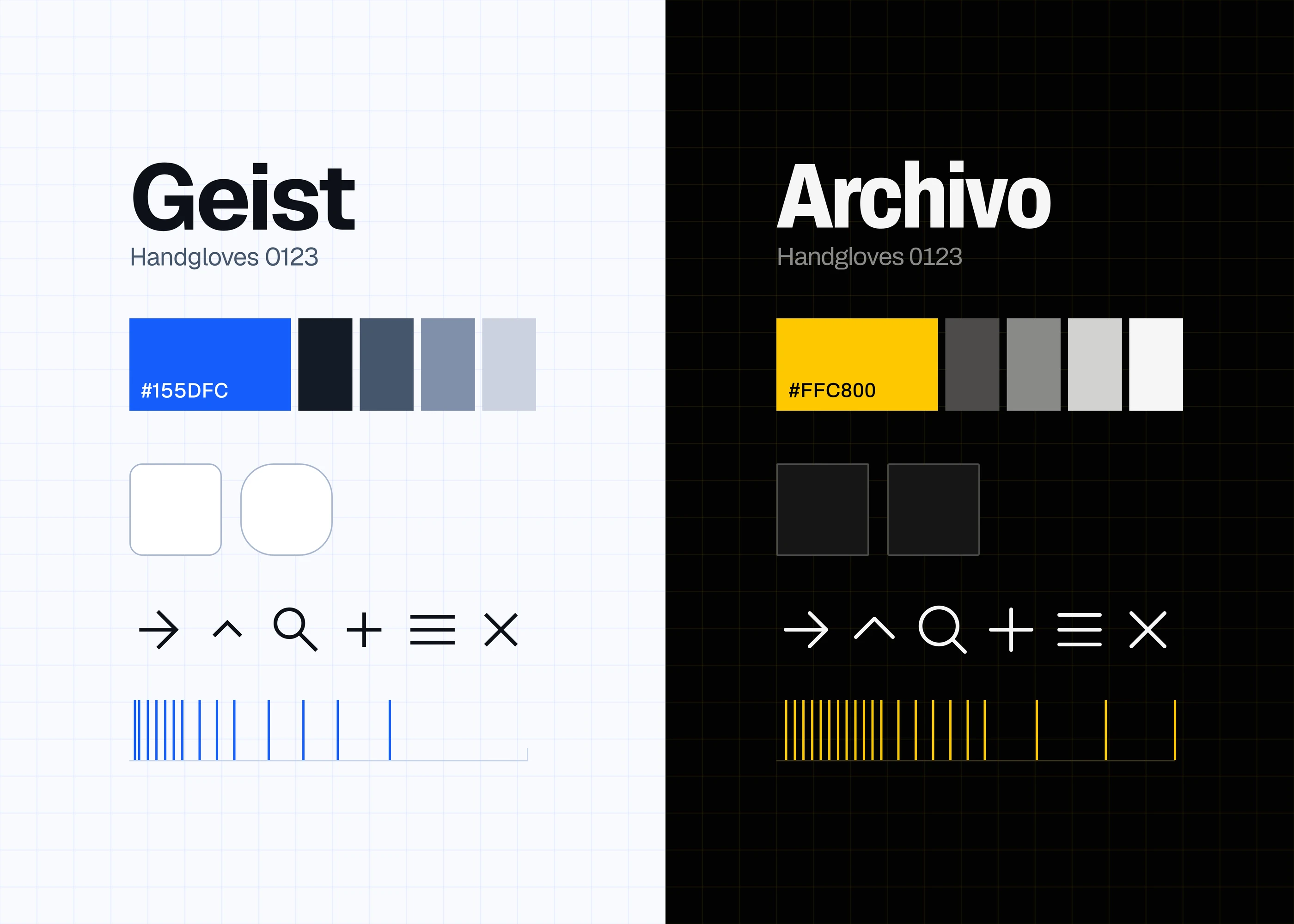 The system under every page
Someone still decides what you see
The lists in Browse work while they're few. When the crowd comes, thousands of lists compete for a few places on Home, and whoever decides which to show becomes one taste again. So ranking can't be avoided. The real question is what gets ranked, and how openly.
My proposal, from October and not built yet, sits in between: the algotorial.

So at scale, the reason to watch still comes from people.
What I'd count
The film page
Film page to play, or a save
The algotorial
Plays from non‑YOW curators
YOW is free and ad-supported, so a play that's watched is how it earns: film page to play is the viewer and the business in one number. YOW soft-launched on 16 November and is in testing. This design is handed off, and how much of it is in that build isn't settled yet.
- Role
- Product Design Intern, the first designer
- When
- May 2026 – now
- Where it stands
- Handed offHome, the film page, Browse, profiles and sign-in